Creating a design system from scratch
A good component library and design system are fundamental to improve speed of execution and allow teams to iterate through ideas and hypotheses much faster compared to the classic workflow where UX and UI are separate.
Requirement:
Create a component library / design system to allow for easier prototyping in design.
Intro:
A good component library and design system are fundamental to improve speed of execution and allow teams to iterate through ideas and hypotheses much faster compared to the classic workflow where UX and UI are separate.
UX designers can now build up wireframes with existing components while UI designers only work on maintaining the system and managing handover with developers.
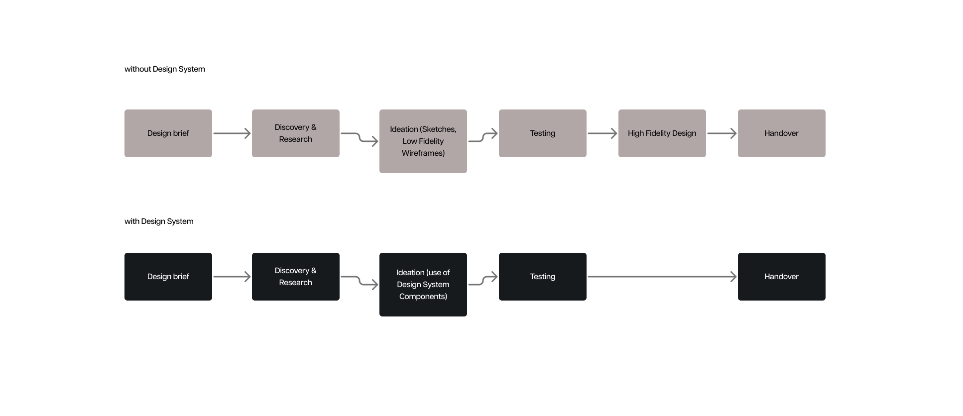
The first step was to take an existing base library whose look and feel is closer to our brand. The development team has been using Chakra UI in development so we took that as a base and started building on top.
You may ask, why not just use ChakraUI then? Well, those libraries are extensive and decently thorough but they are also fixed and harder to personalise down the line. While the styling of the components can be changed it requires work on top of these components which will create bloated code and will likely decrease productivity, therefore going against one of the main principles of building a design system: speed of execution.
Open source component libraries are a good resource to use for prototypes or MVPs but once you start building your app, having your own custom components, tailored to your brand, tailored to your use cases and functionalities is fundamental.
Using Atomic Design Principles
First thing to do when creating a design system is to create principles for categorising all the components. Even if we only have 30 components, if they are not organised properly it is very easy to get lost or create duplicates.
The best way to organise a component library based on my experience is to use Atomic Design principles by Brad Frost.
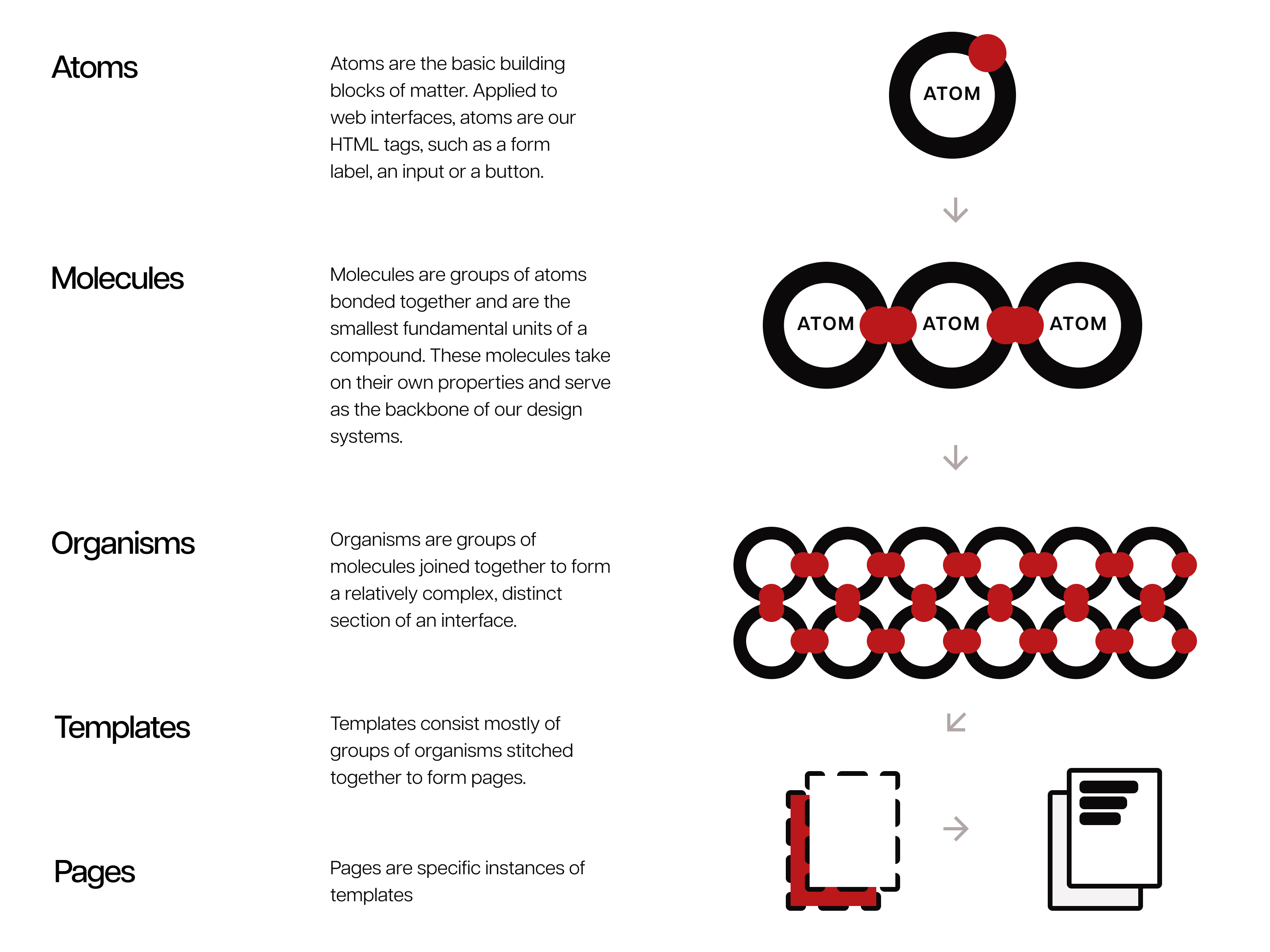
Copyright - Brad Frost
The main principle of Atomic Design is to divide the components hierarchically, starting from Atoms, which are single element components, like an input field for example, then Molecules, which is a component comprised of one or more atoms, like a form field with a label a submit button, then Organisms which are comprised of one or more molecules, such as a complete form component, then Templates which are full structures comprised of multiple Organisms such as a form component (need to revise these and fix) and finally Pages, which are fully formed templates.
I have taken a few Chakra components and the base html fields needed for a good component library and got to work
The structure
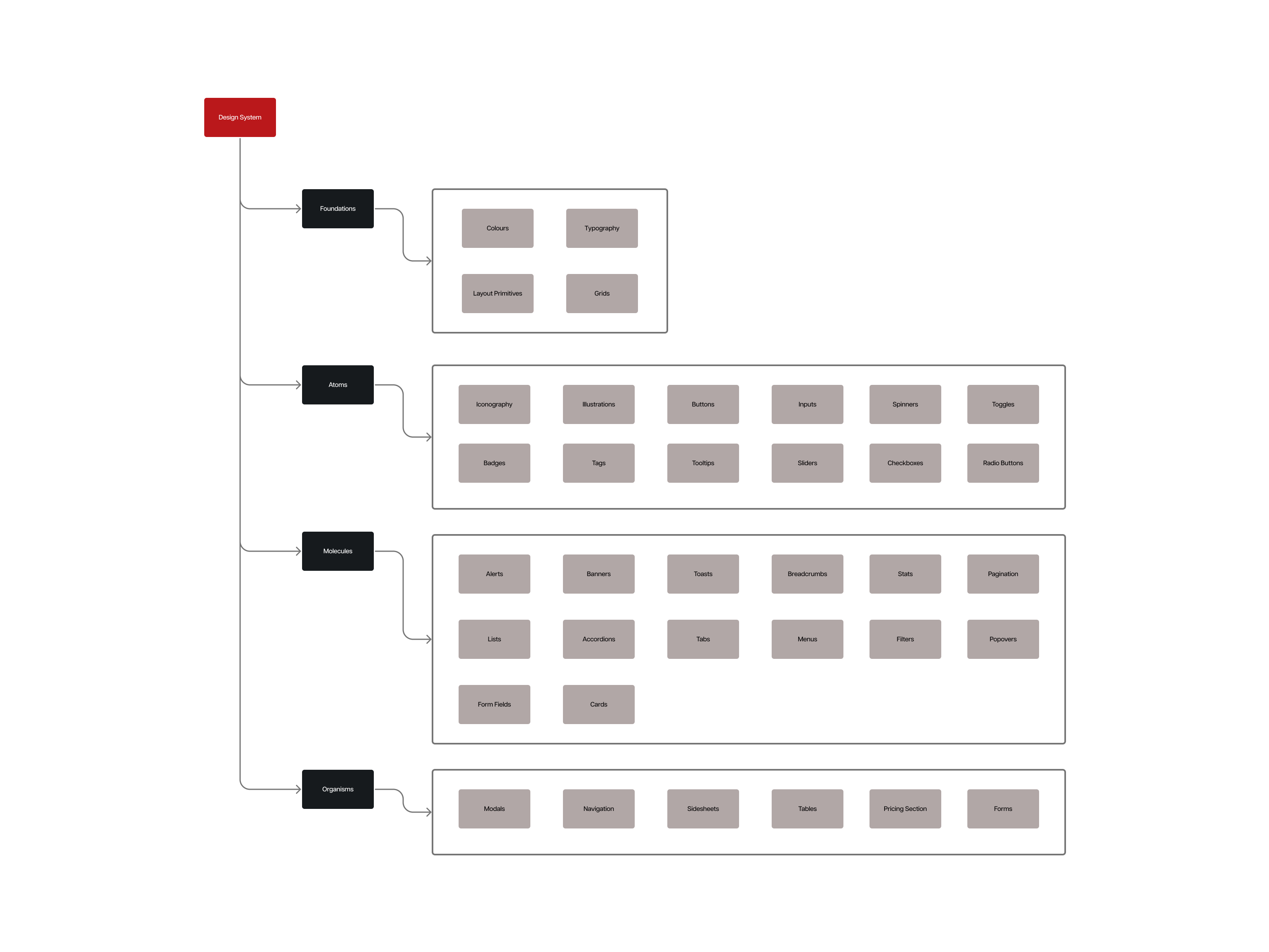
Foundations
The foundations includes all of the base elements that each component and atom is going to be made of, these include:
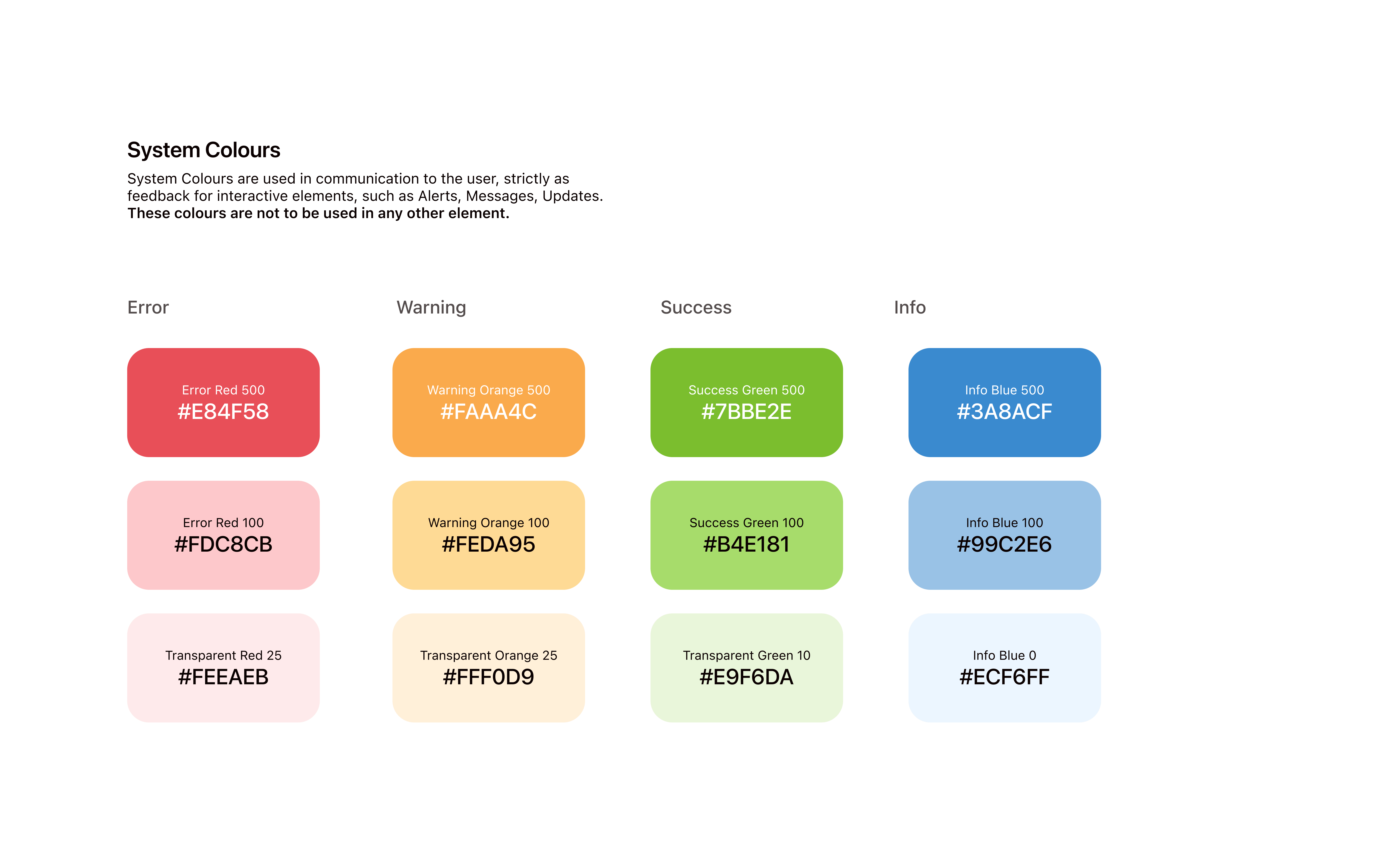
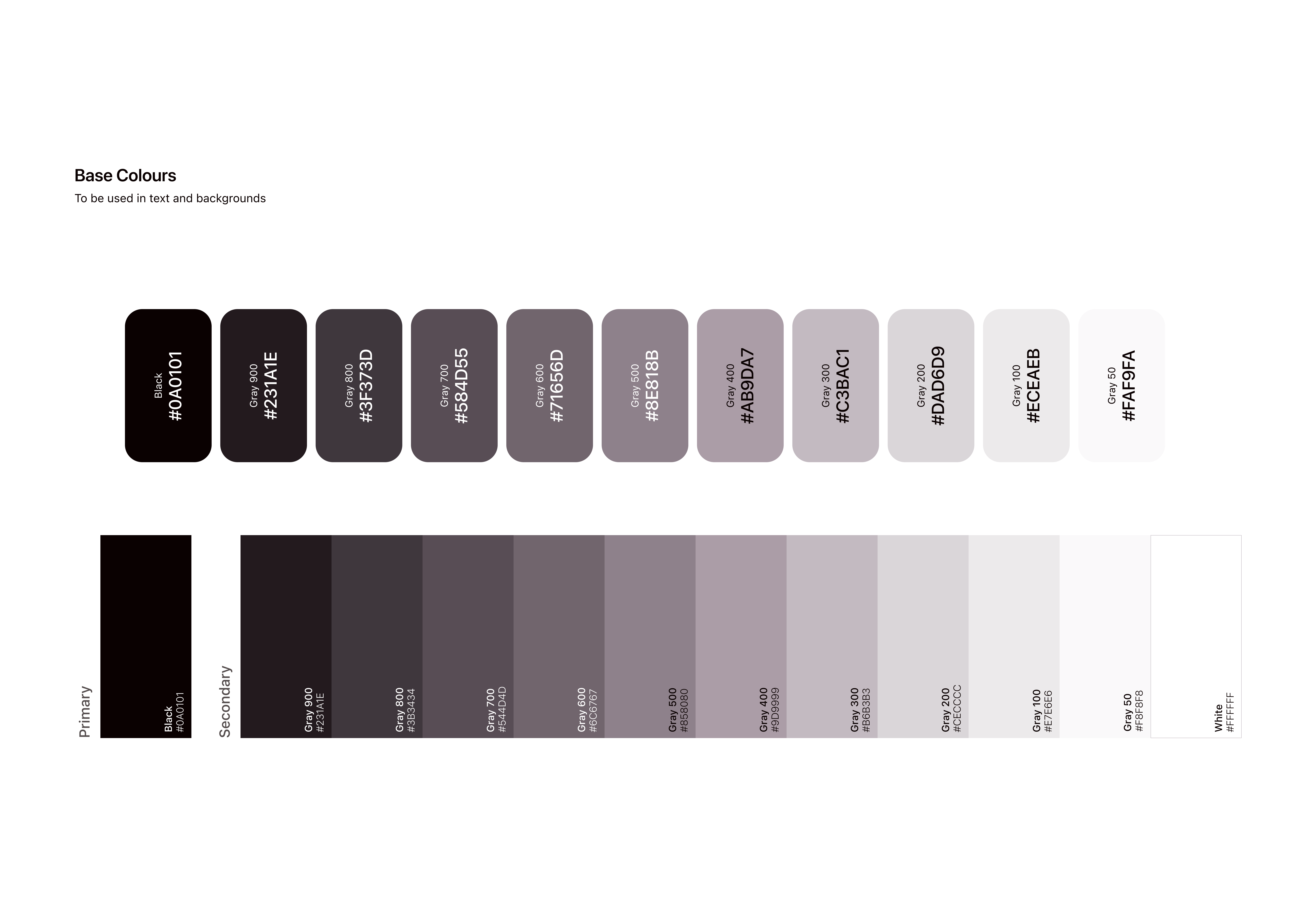
Colours
Which includes all the colours that can be used within the system, this is sub-divided into four categories:
- Base colours, which are the black and white shades and tints adjusted to the main brand colour
- Brand colours, which are the main brand colour accents, with shades, tints, muted versions and gradient variations.
- System colours, which are the base green (for success), orange (for warning), blue (for information) and red (for errors)
- Graphs colours, which are variations of all possible colours that can be used in graphs, adjusted to fit well with the main brand colours.
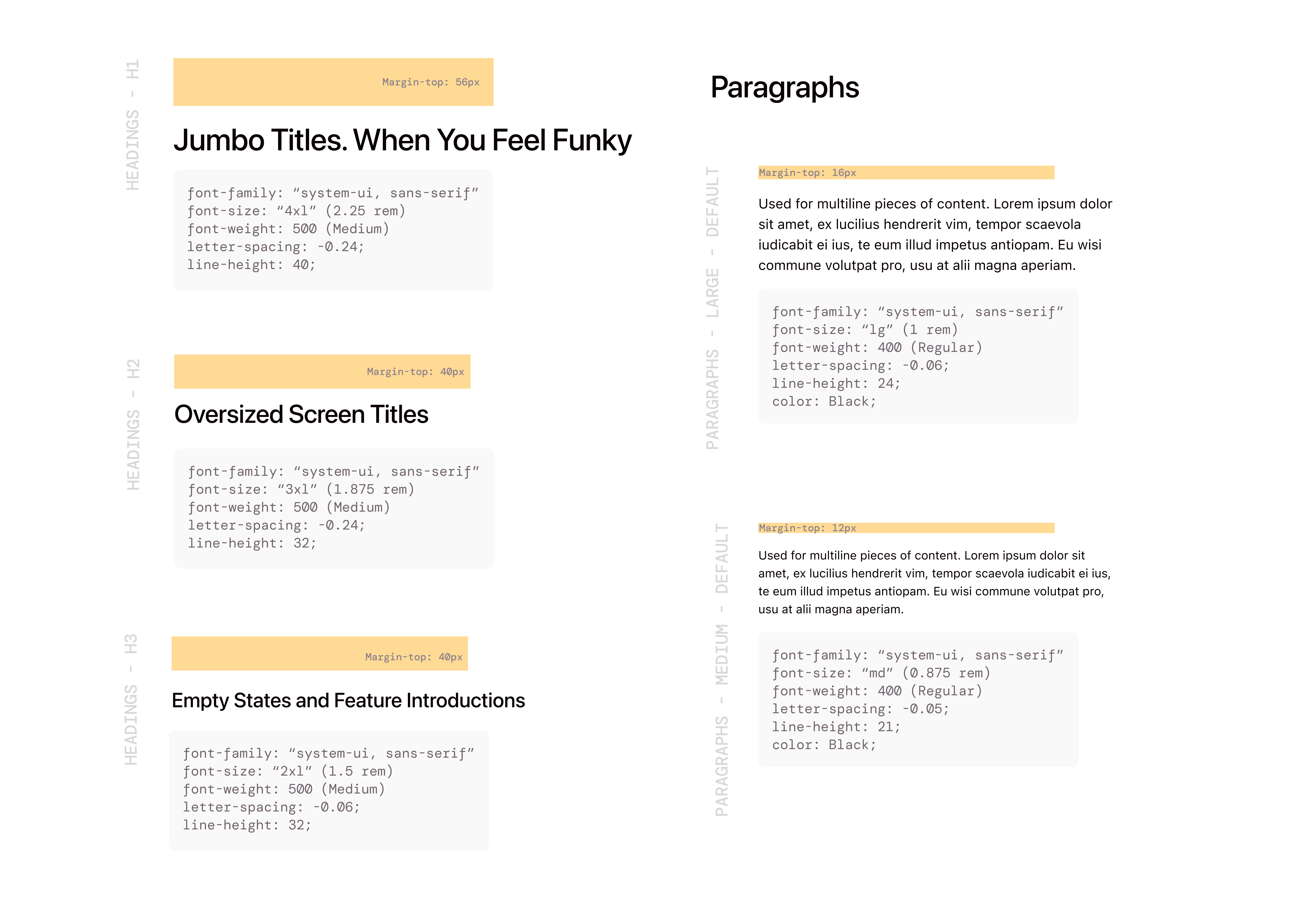
Typography
Which includes all possible text use cases from headings, to links, to single line text, to paragraphs.
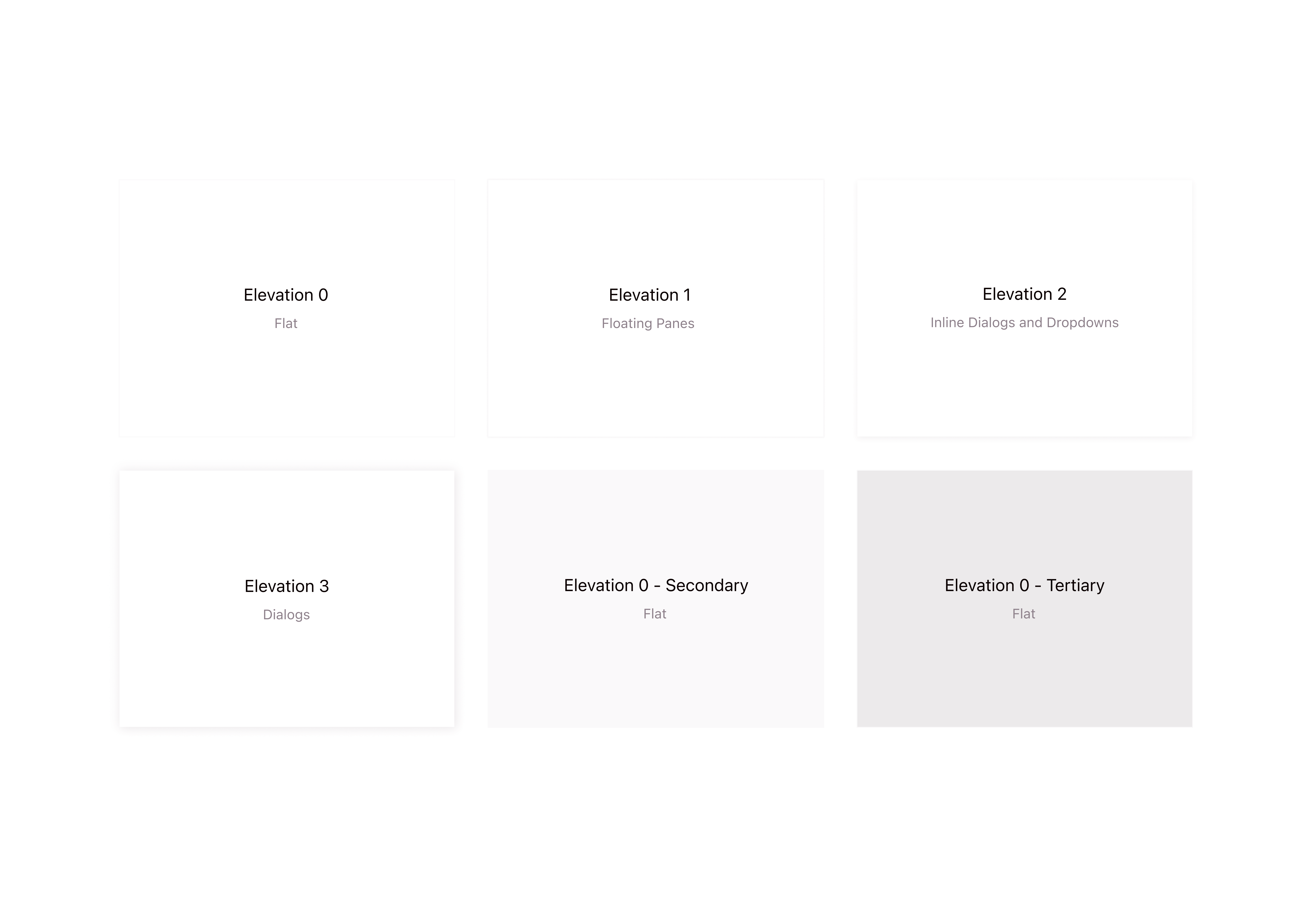
Layout primitives
Which is the base foundation of all containers, boxes, cards and layouts. These are subdivided into different elevations and different background colours.
Grids
Which includes all the grid layouts for every single screen (large desktop, desktop, tablet, mobile and more)
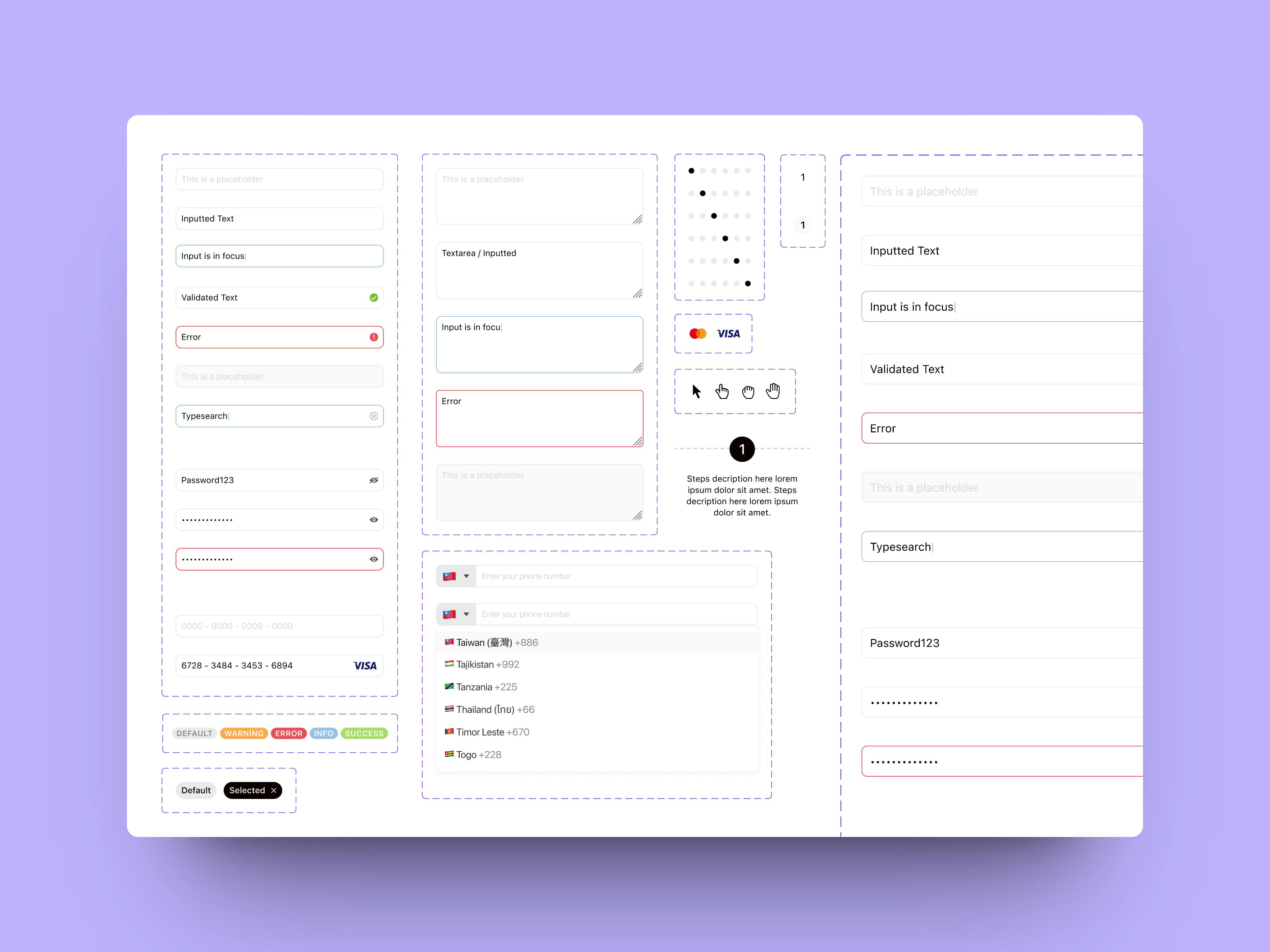
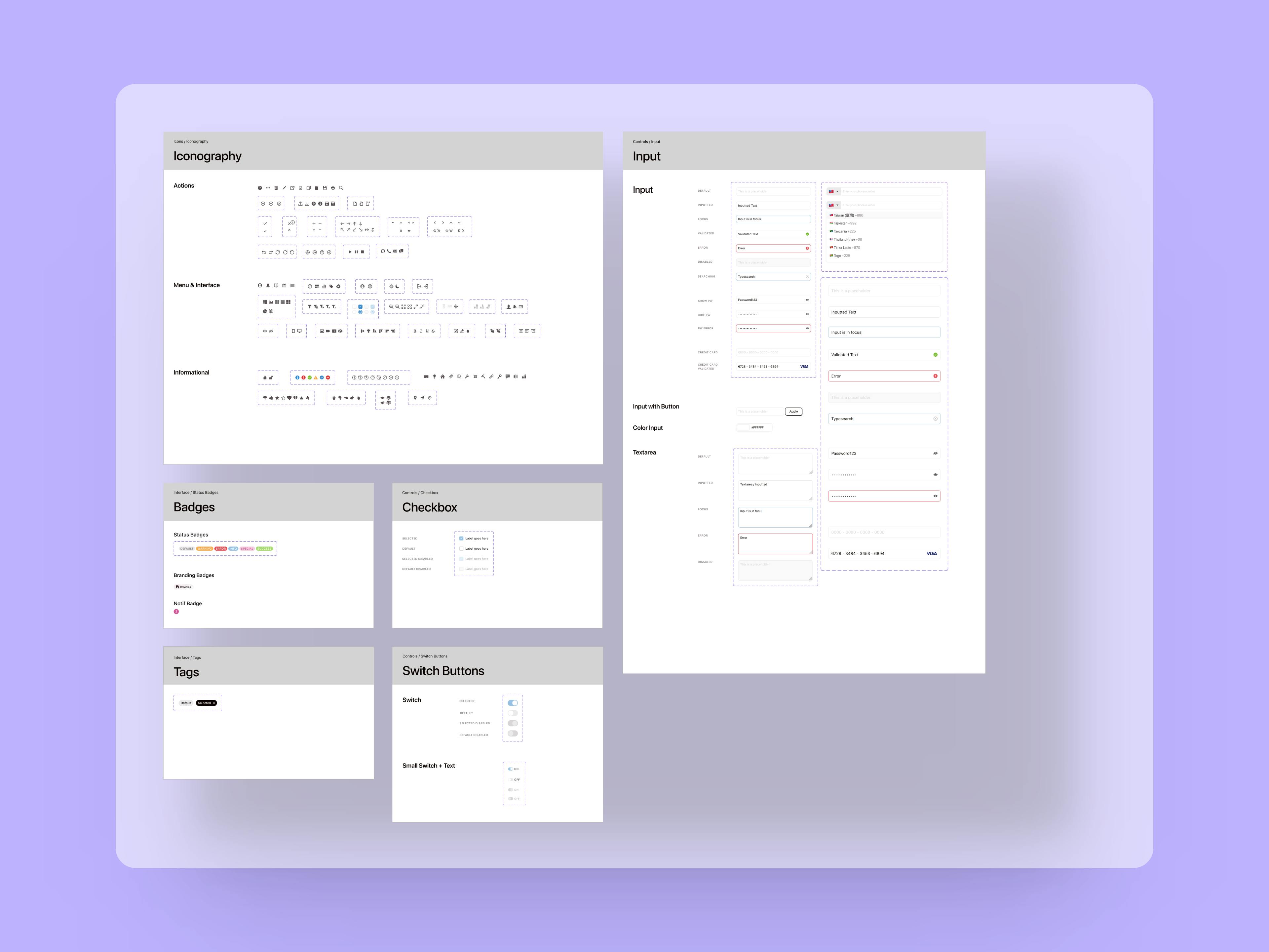
Atoms
These are the building blocks of all interface components and include base HTML elements such as labels, checkboxes, radio buttons, buttons, inputs and more.
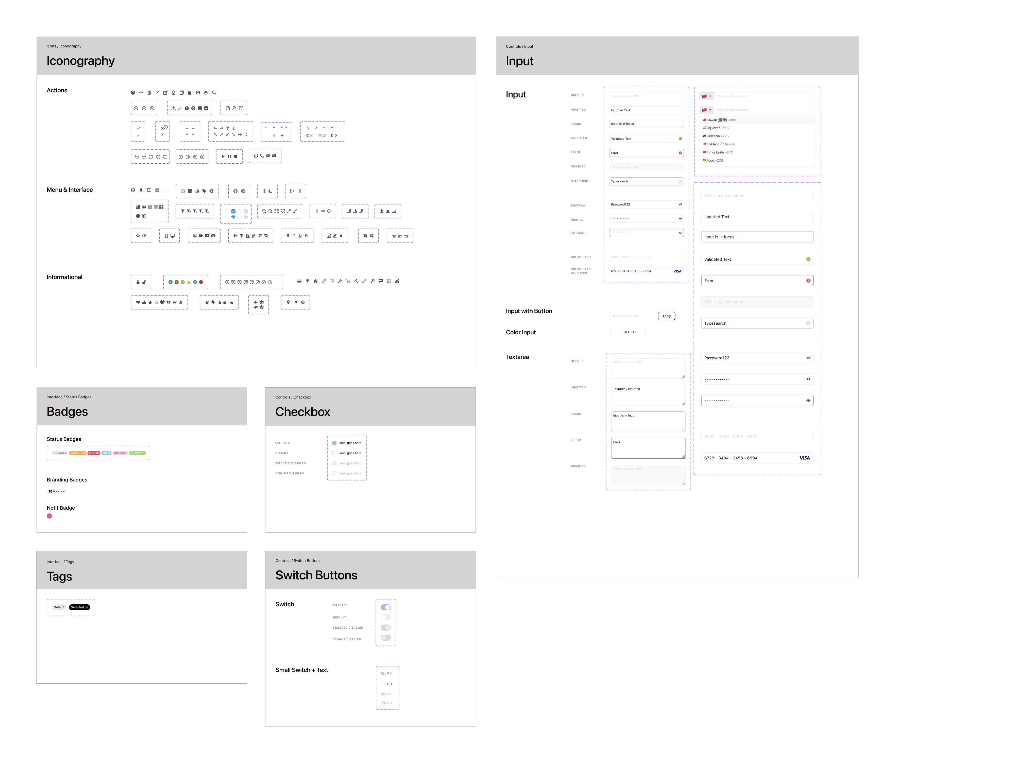
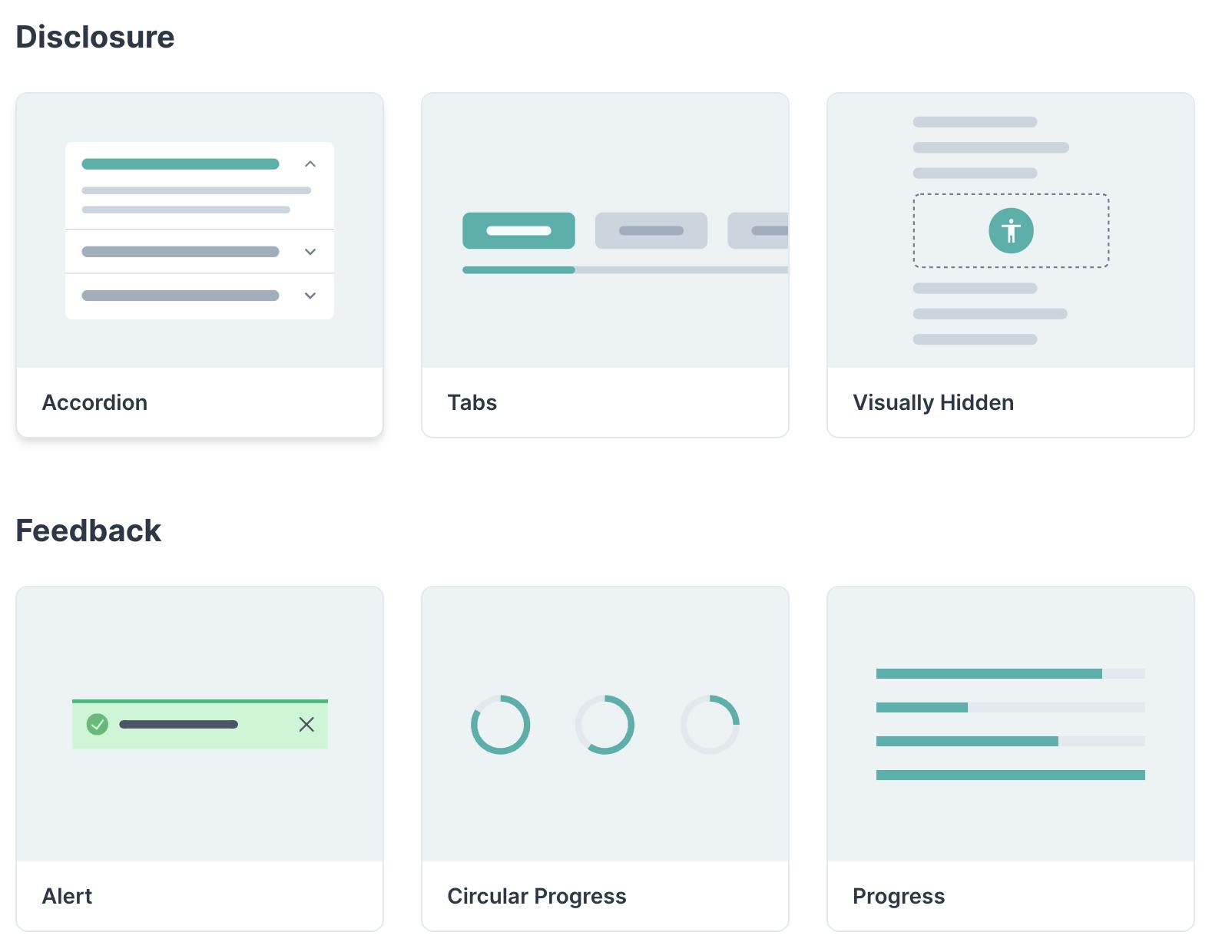
Molecules
These are components made of two or more atoms, that usually have a specific function. Like a search input with a label, search icon and different states.
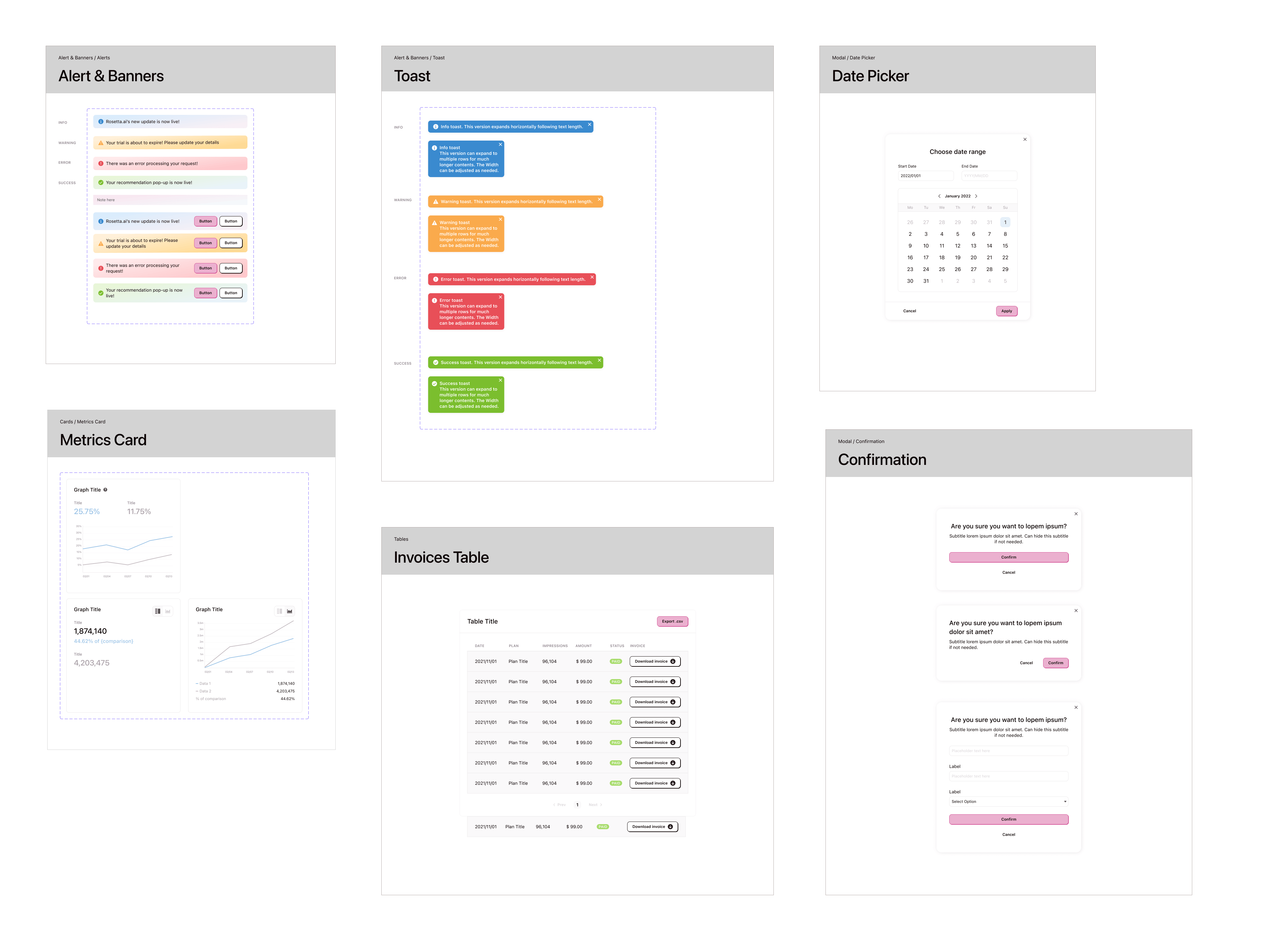
Organisms
These are more complex components that incorporate two or more molecules and serve more than one specific function. An example of an organism is a header section.
Templates and Pages
These are the final components built with multiple organisms, templates are similar to bare bones page layouts without imagery and content, whilst pages are the completed interface design.
In this specific case, as well as in many other design systems I created earlier, templates and pages have not been implemented. While templates and pages work really well for content heavy websites like marketing websites or publications/blogs, when it comes to web apps it adds a layer of complexity that doesn't make sense having when building up a minimum viable product or in circumstances where more flexibility is needed, which was the case as lots of features were new and likely to change often.
The result:
A component library of 40+ fundamental components. The impact on the team is increased speed of ideation for the design team and increased speed of execution for the development team. All while maintaining and promoting brand consistency across the whole platform.
Latest Work
Creating a design system from scratch
The Components
The Atoms
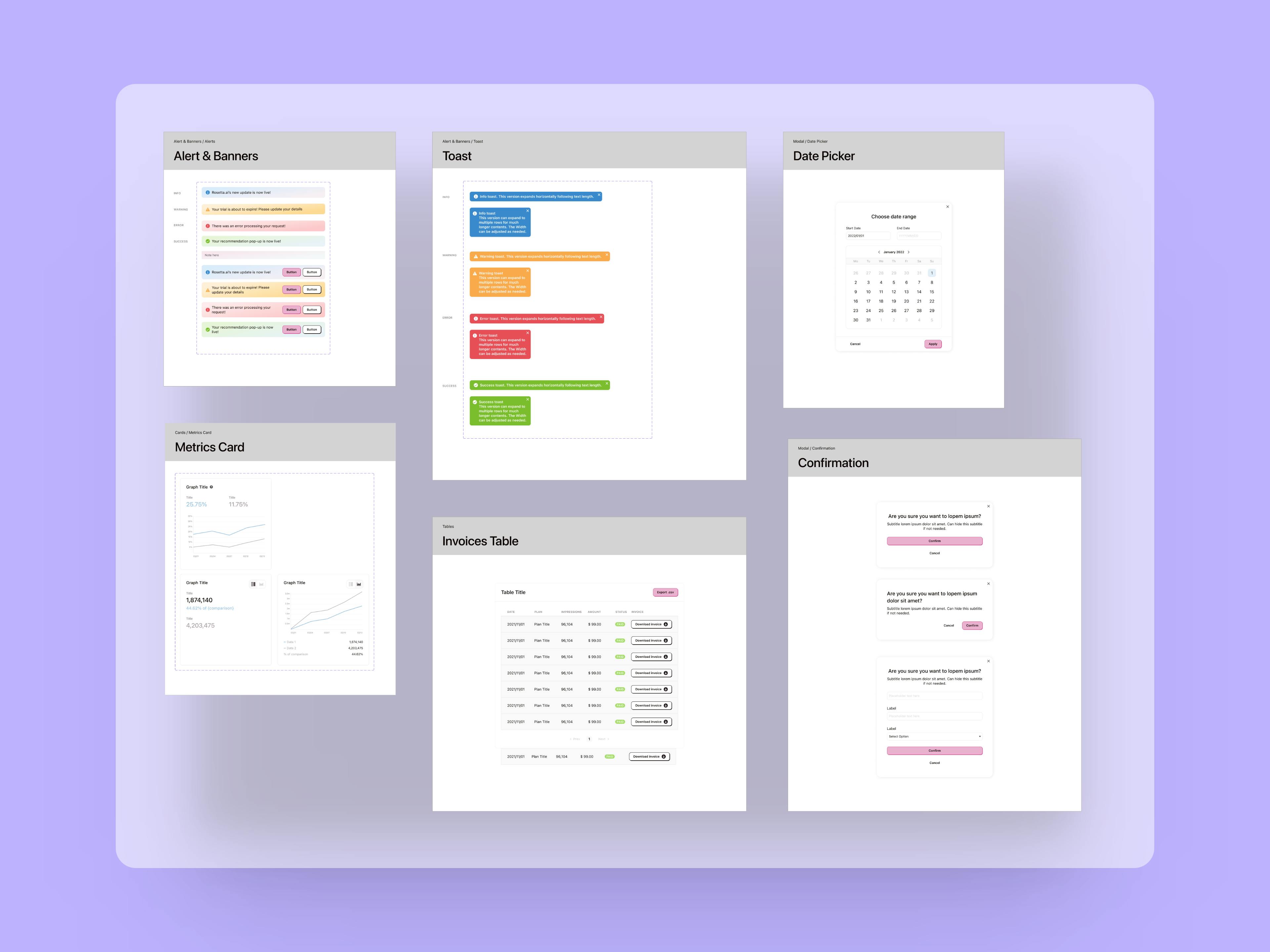
The Organisms
A good component library and design system are fundamental to improve speed of execution and allow teams to iterate through ideas and hypotheses much faster compared to the classic workflow where UX and UI are separate.
Revamping a career website for an outstanding candidate experience and job discovery
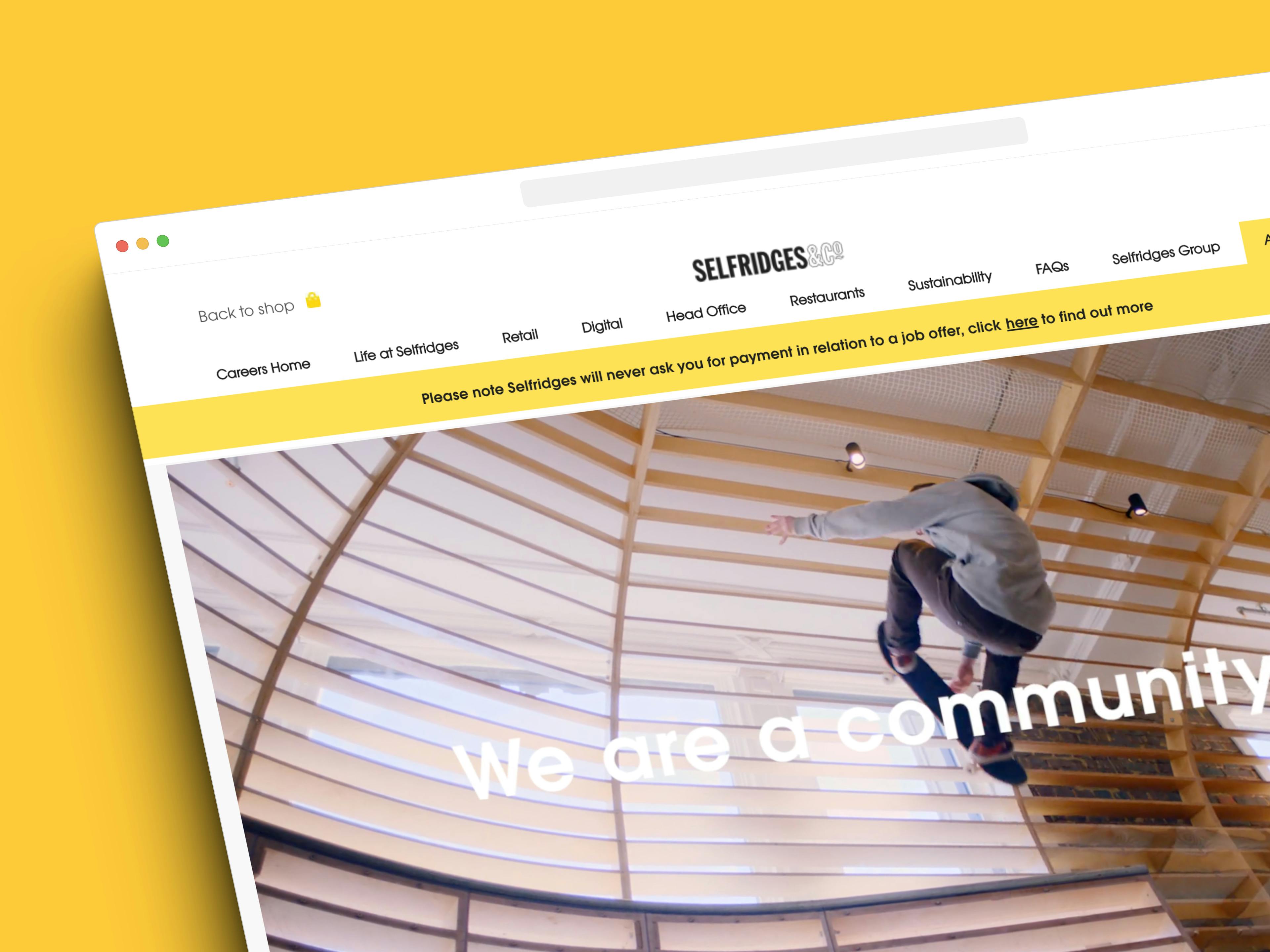
The completed website
Selfridges is a world-renowned, award winning department and online store with 4 stores in the UK and a worldwide online presence.
Designing an engaging and accessible site for a rare dementia support charity
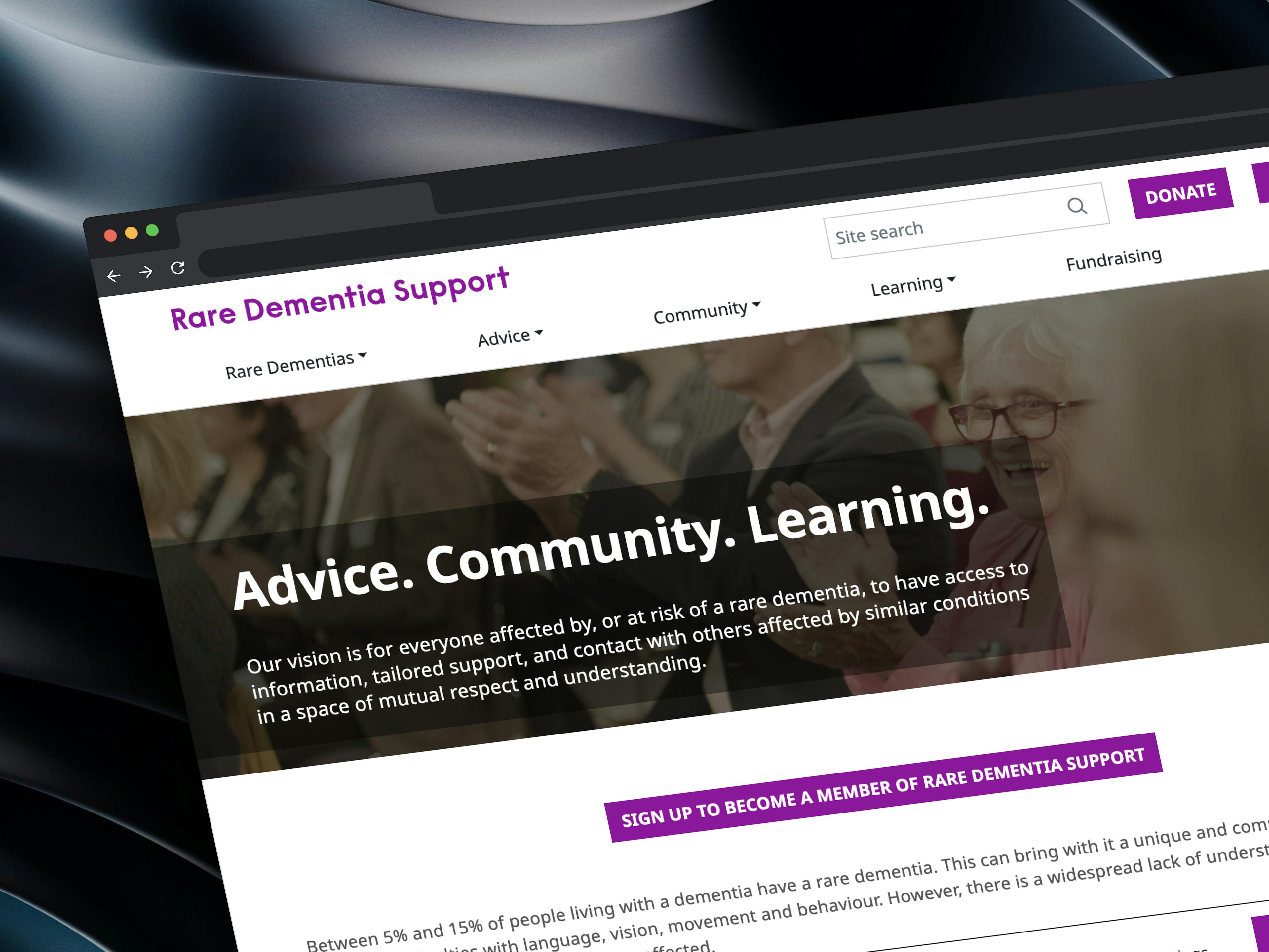
The completed website
Rare Dementia Support (RDS) is a world-leading, UK-based service provided by the UCL Dementia Research Centre (DRC) and partners and funded by The National Brain Appeal.
Crafting innovative solutions for an e-commerce giant
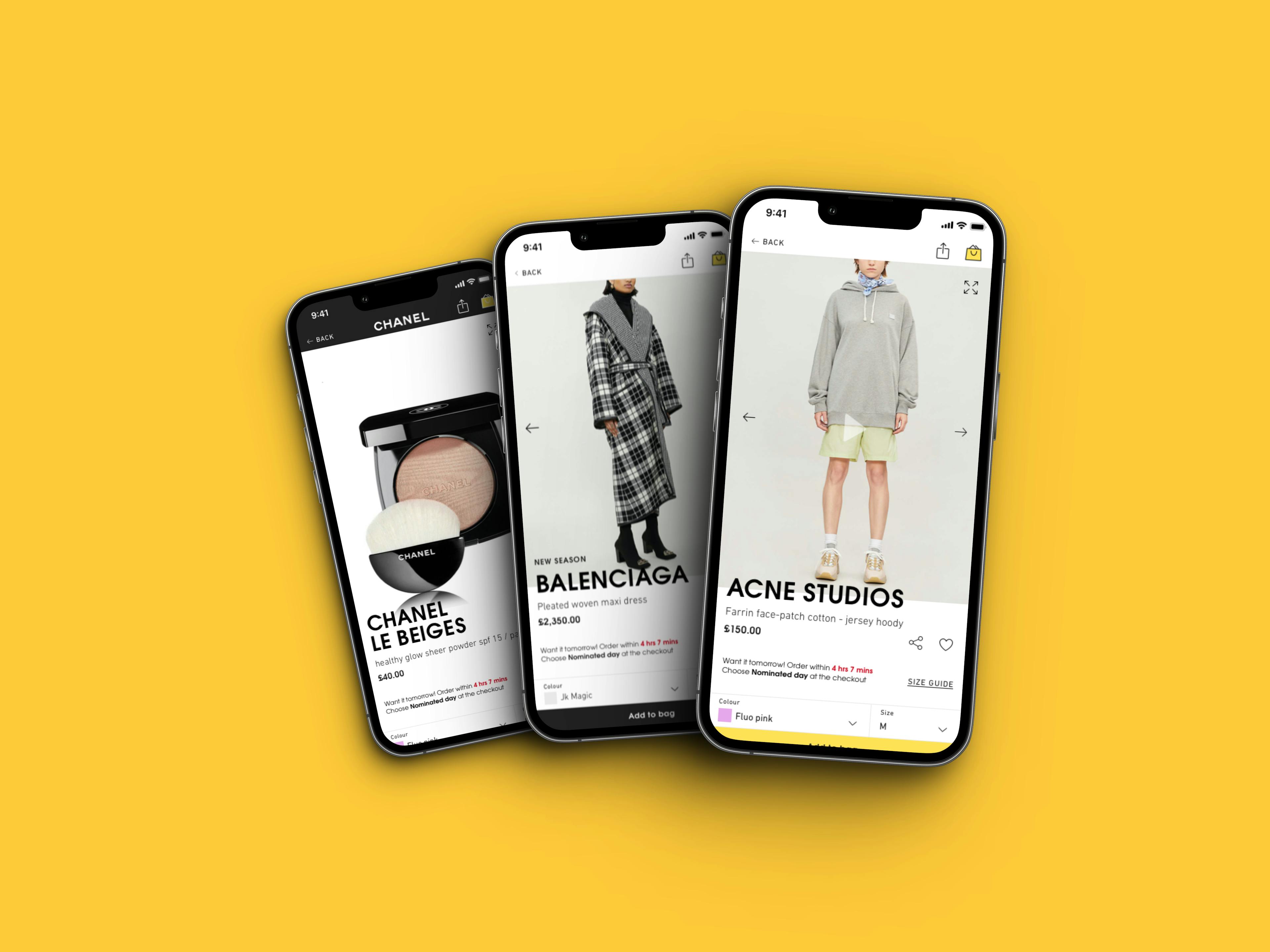
Re-design work for the mobile app
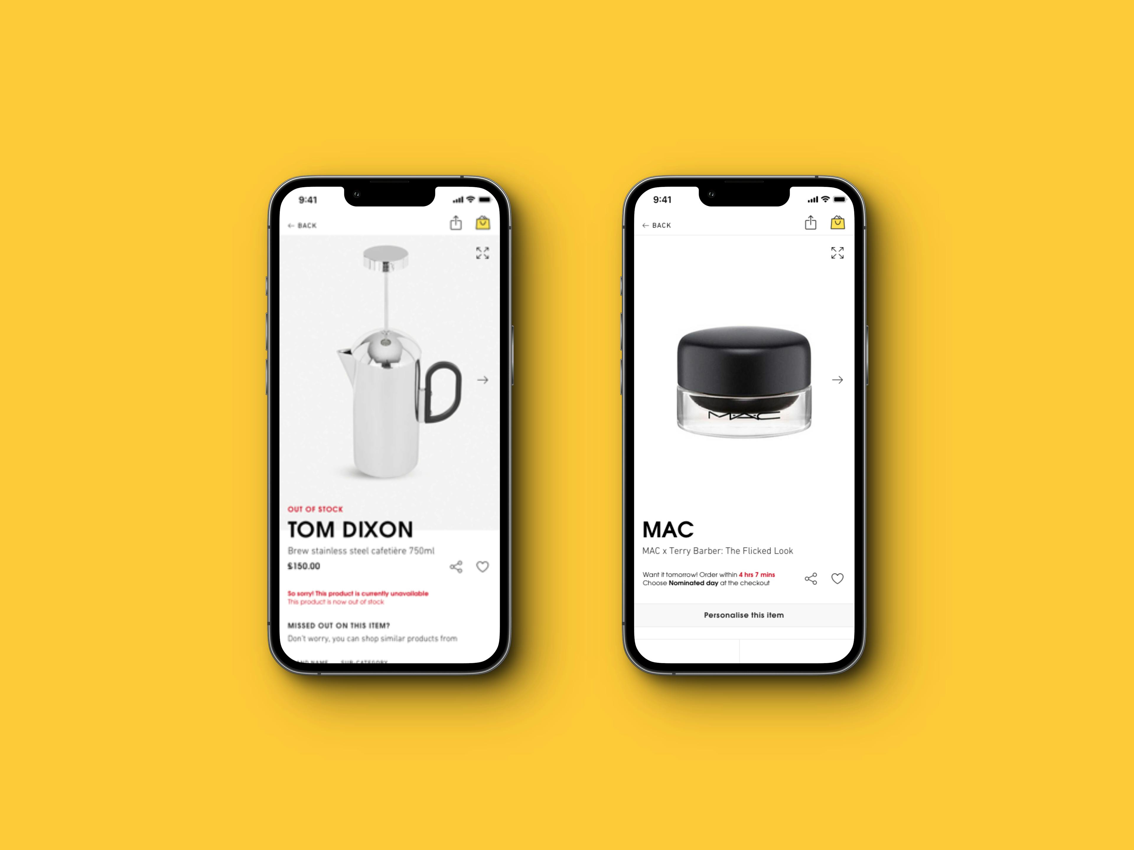
Collection of edge cases for the Product Detail Page

A re-designed and exciting careers site.
I have worked as part of the Selfridges UX team and have taken part in exciting projects such as the re-design of their website and mobile apps, the re-design of their careers site and a number of innovative and experimental solutions for their digital assets that resulted in significant improvements in their metrics.