Crafting innovative solutions for an e-commerce giant
I have worked as part of the Selfridges UX team and have taken part in exciting projects such as the re-design of their website and mobile apps, the re-design of their careers site and a number of innovative and experimental solutions for their digital assets that resulted in significant improvements in their metrics.
I had the great pleasure to call Selfridges&Co. a client between March 2019 and July 2020. I worked on site for 3 months in their Central London office before moving completely remote in July 2019.
The projects I was involved in varied from BAU and Optimisations to external projects, to more conceptual work that unfortunately I won't be able to disclose.
I'm gonna walk you through 3 different projects from my time at Selfridges:
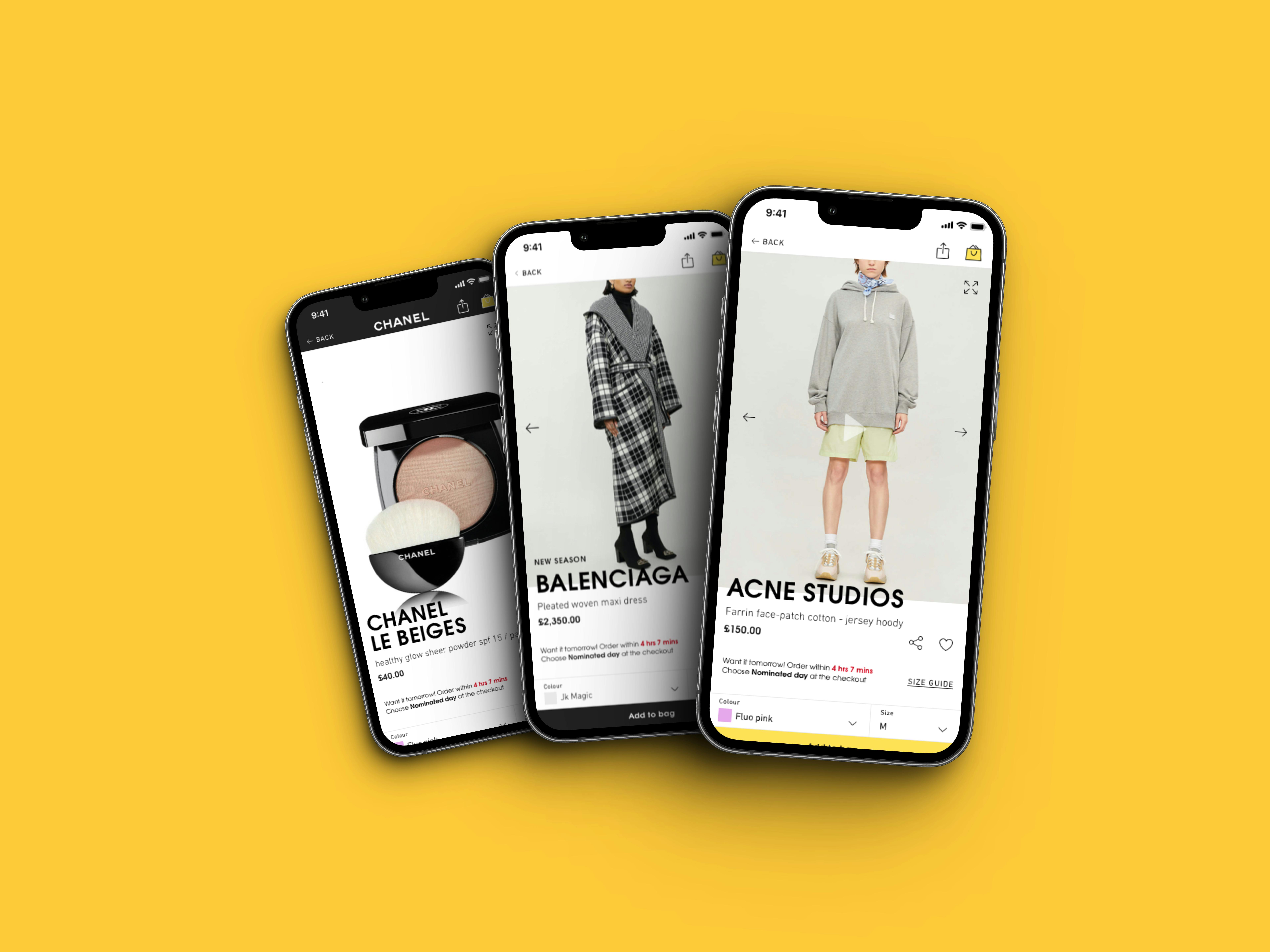
1. Adapting web store design patterns to native Mobile App patterns
The project below is one of the latest I worked on and it consists specifically of adapting web elements of their re-design to fit into a fully native experience. I worked on the adaptation of the Product Detail Page and its numerous edge cases.
The web re-design has been implemented by the Creative and UI team with principal focus on web elements and patterns.
Main goal of the project was to take the web elements and adapt these to the native mobile app grids, patterns and best practices whilst still maintaining the look and feel of the re-design and of the brand.
This project is strictly technical design adaptation, here are some examples of translated patterns and reasoning behind them.
Product Image
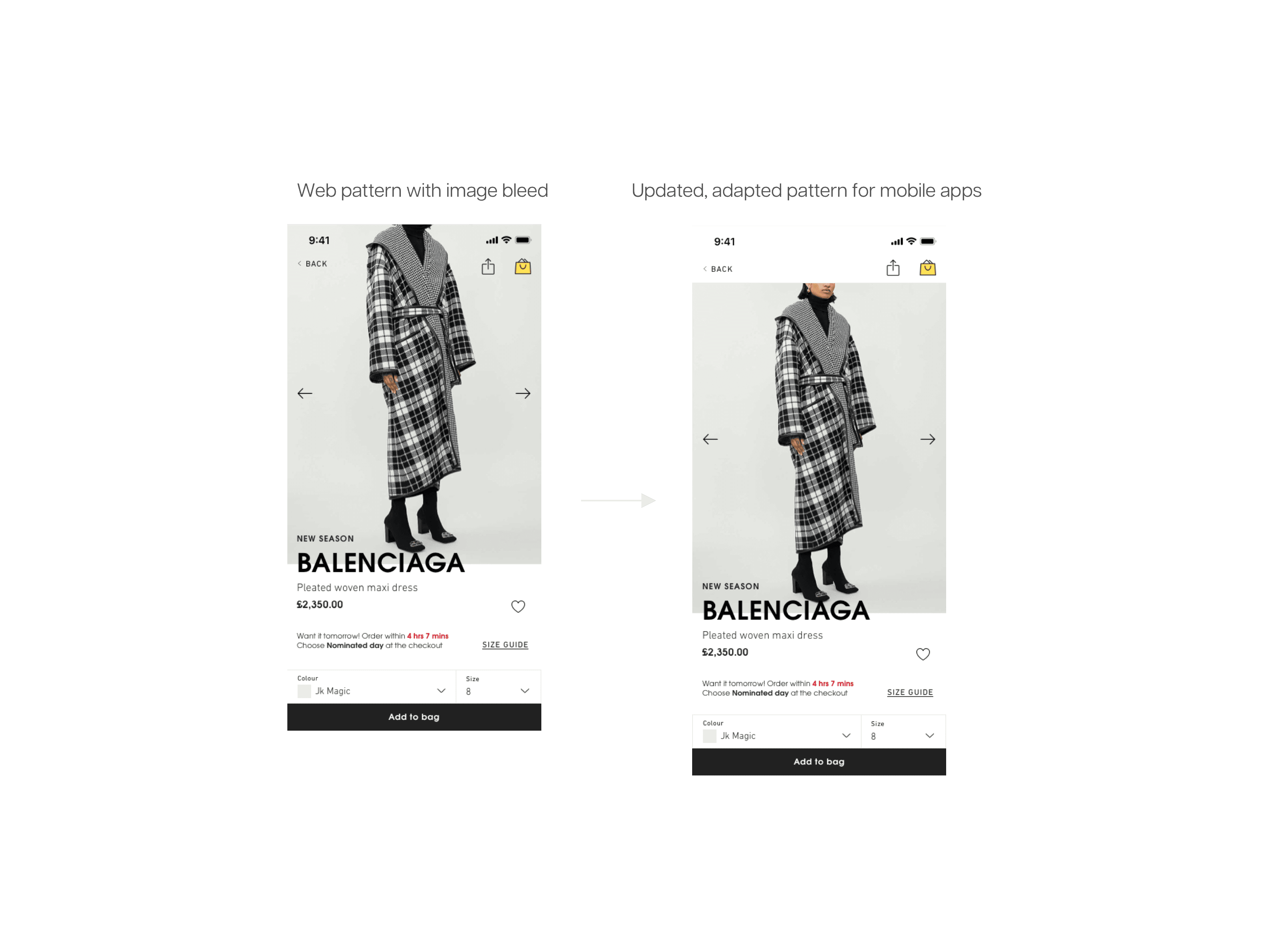
In the adapted version a header is present allowing the user to clearly see the full image and rendering the navigational controls slightly more accessible.
Contrary to web, a mobile app doesn't have an added navigation as one that is found in the browser, therefore the bleed would overflow into the app bezels on iOS and aprt of the image would be cut off.
Product Detail Component
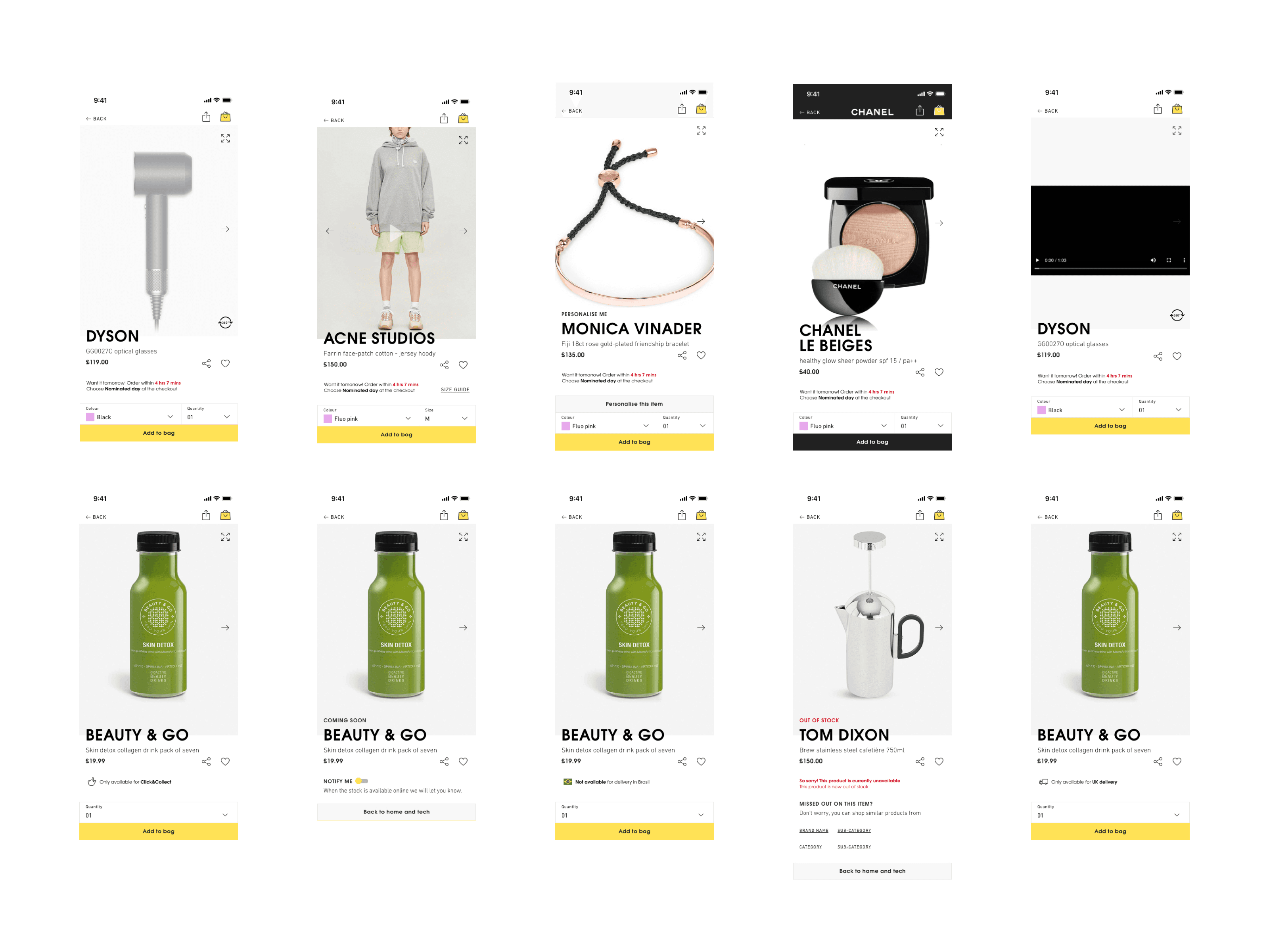
I worked on numerous edge cases, such as personalisation, gift messaging, delivery, out of stock notices etc.
Every edge case has been implemented into designs, components that have been added to a styleguide library file in Sketch and then documented every case with scenario and rules.
2. Stock notifications in the Mobile Apps
This project was part of an optimisation effort to allow users to enable stock notifications for specific products.
Business case was to increase urgency and fear of missing out in users and purchase products as soon as they're back in stock, this way increasing conversion rates..
The process
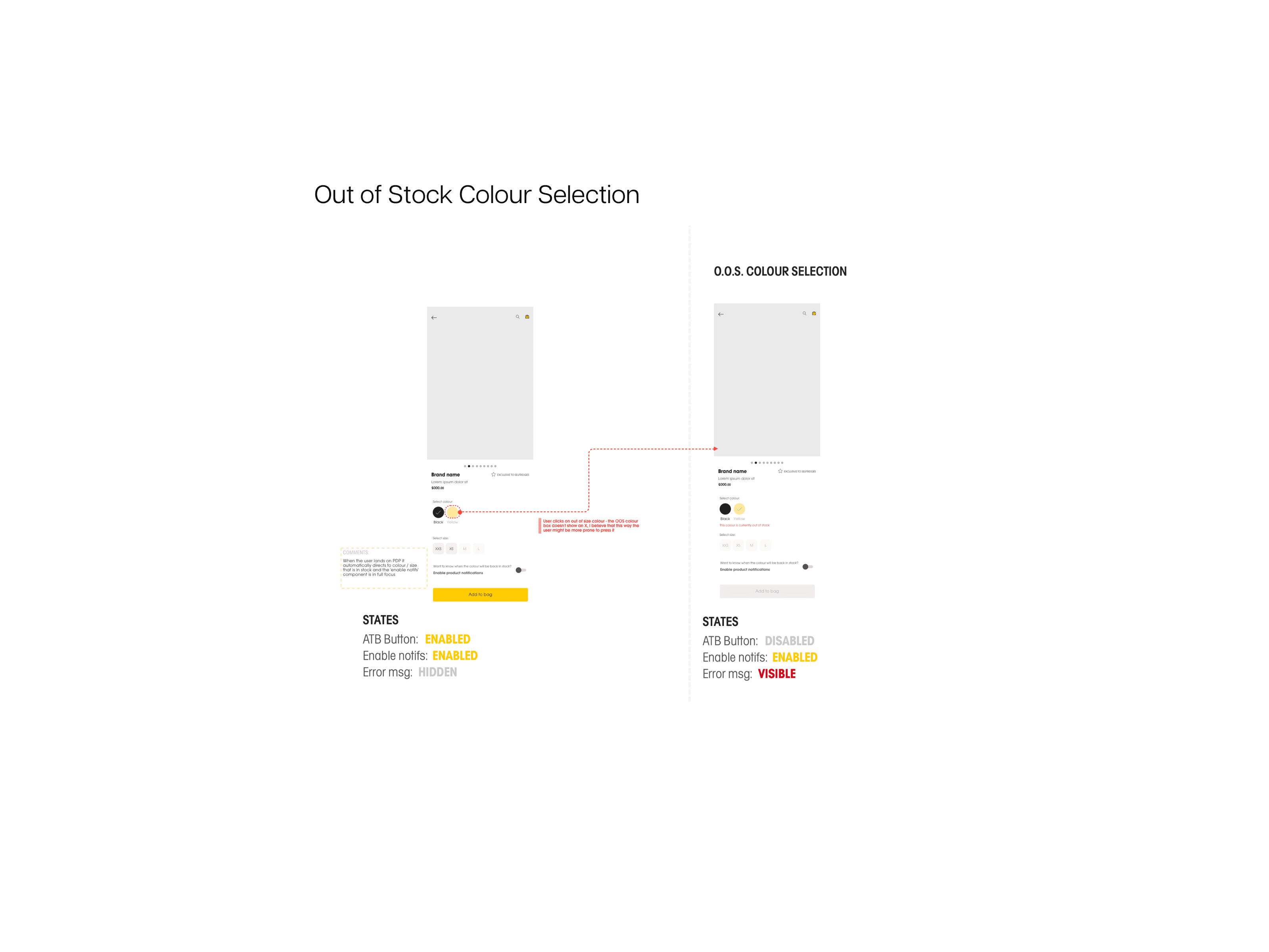
I started outlying all possible edge cases and scenarios for different states of product stock availability, which in this case were:
- Specific Colour is Out of Stock
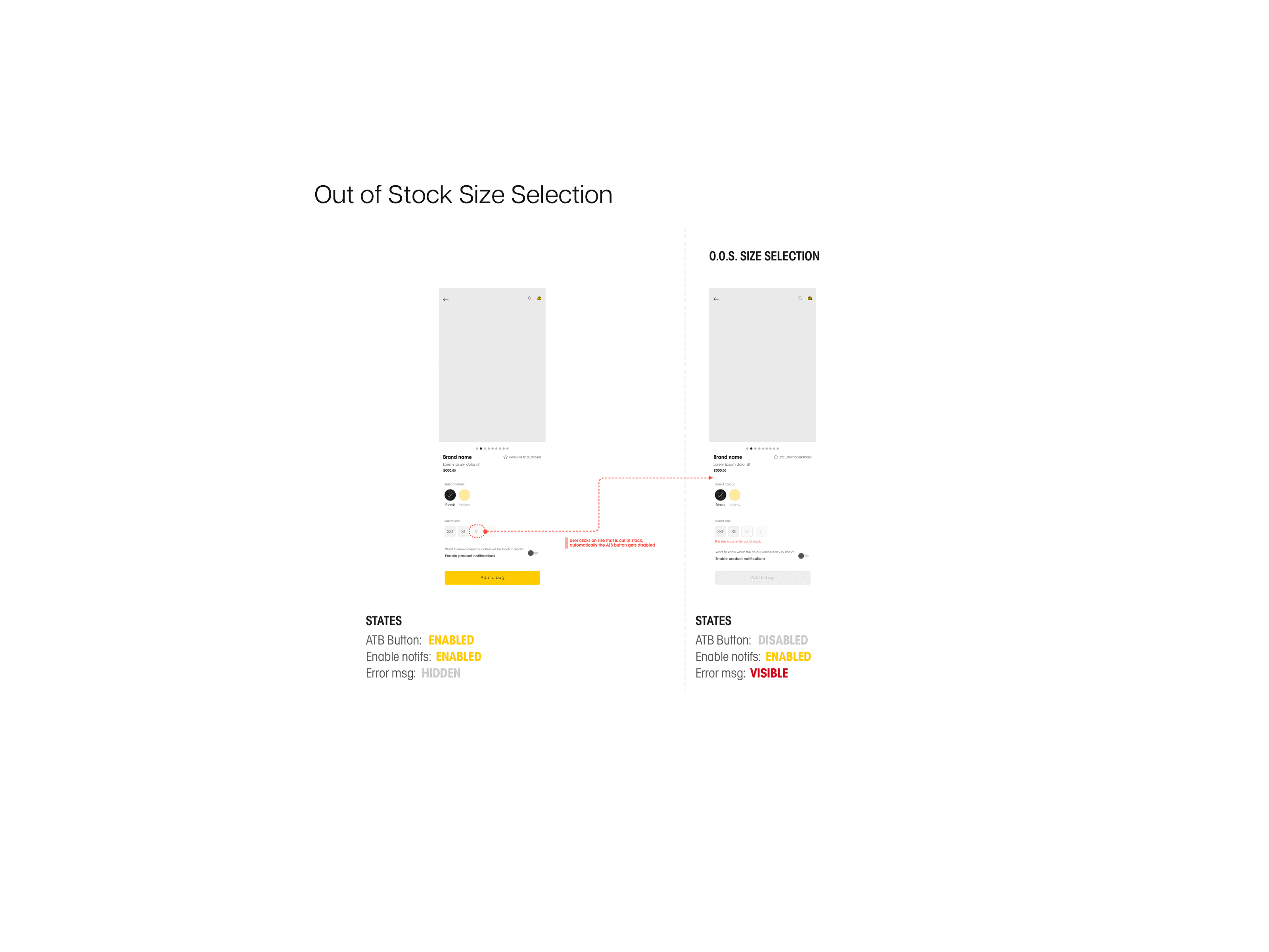
- Specific Size is Out of Stock
- Product is in Stock but specific size is Out of Stock
Out of stock colour selection
Out of stock size selection
In stock size selection
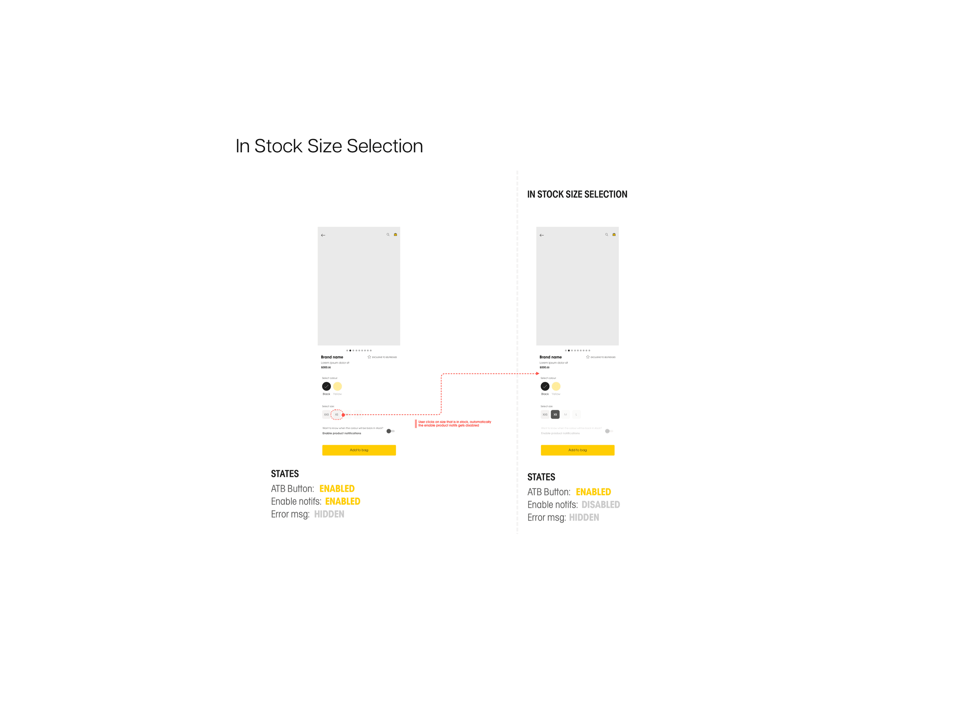
You can see documented all components for the "Add to Bag" button, "Enable notifications" component and "Error Messaging" component.
I have worked on the first ideation of user flows, wireframe and documentation and on the second iteration of the high fidelity designs when I have adapted the old design to match the re-design, as I have shown in the Mobile App UI tab.
3. Ballot to Buy - currently known as The Yellow Draw
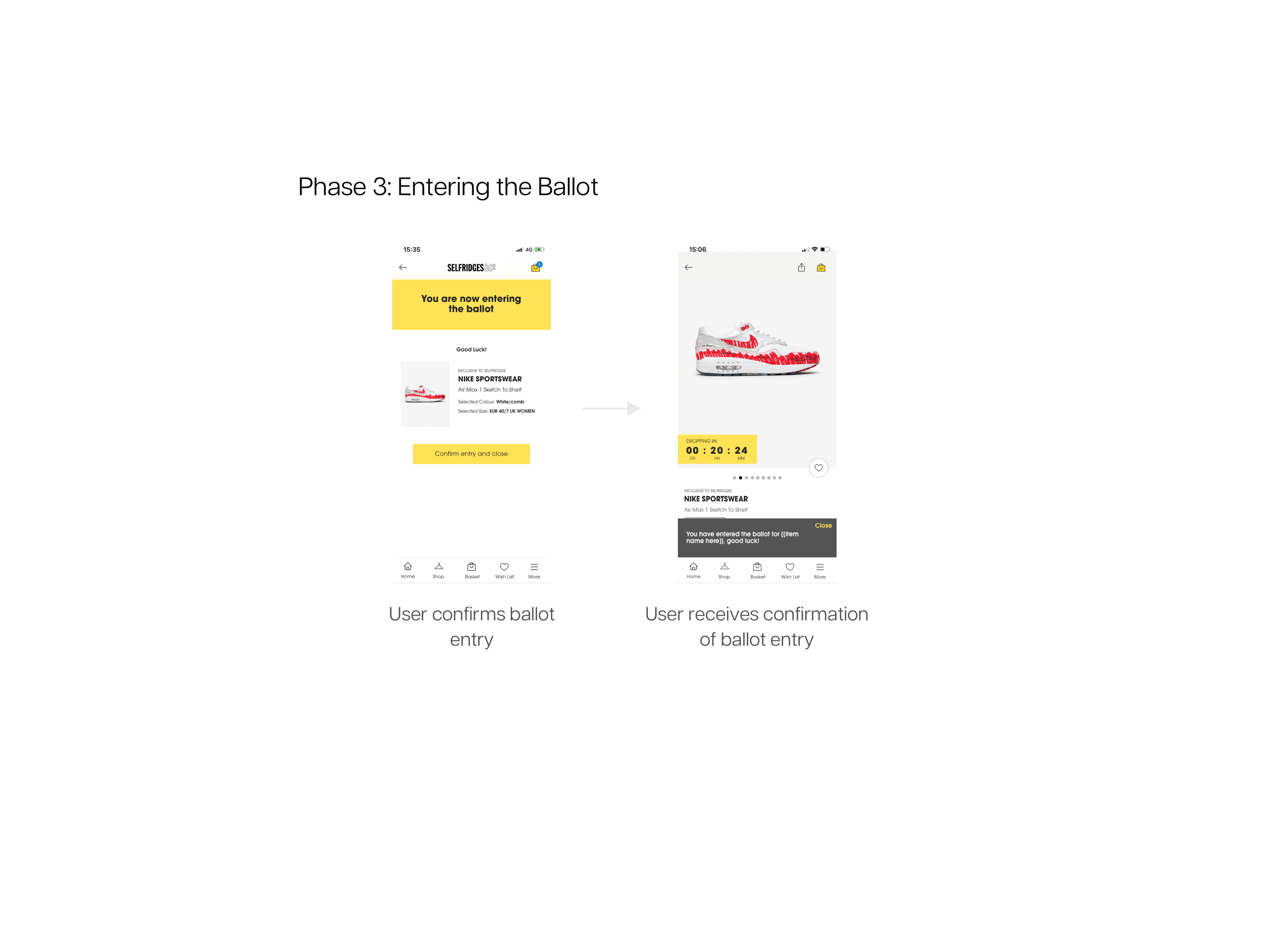
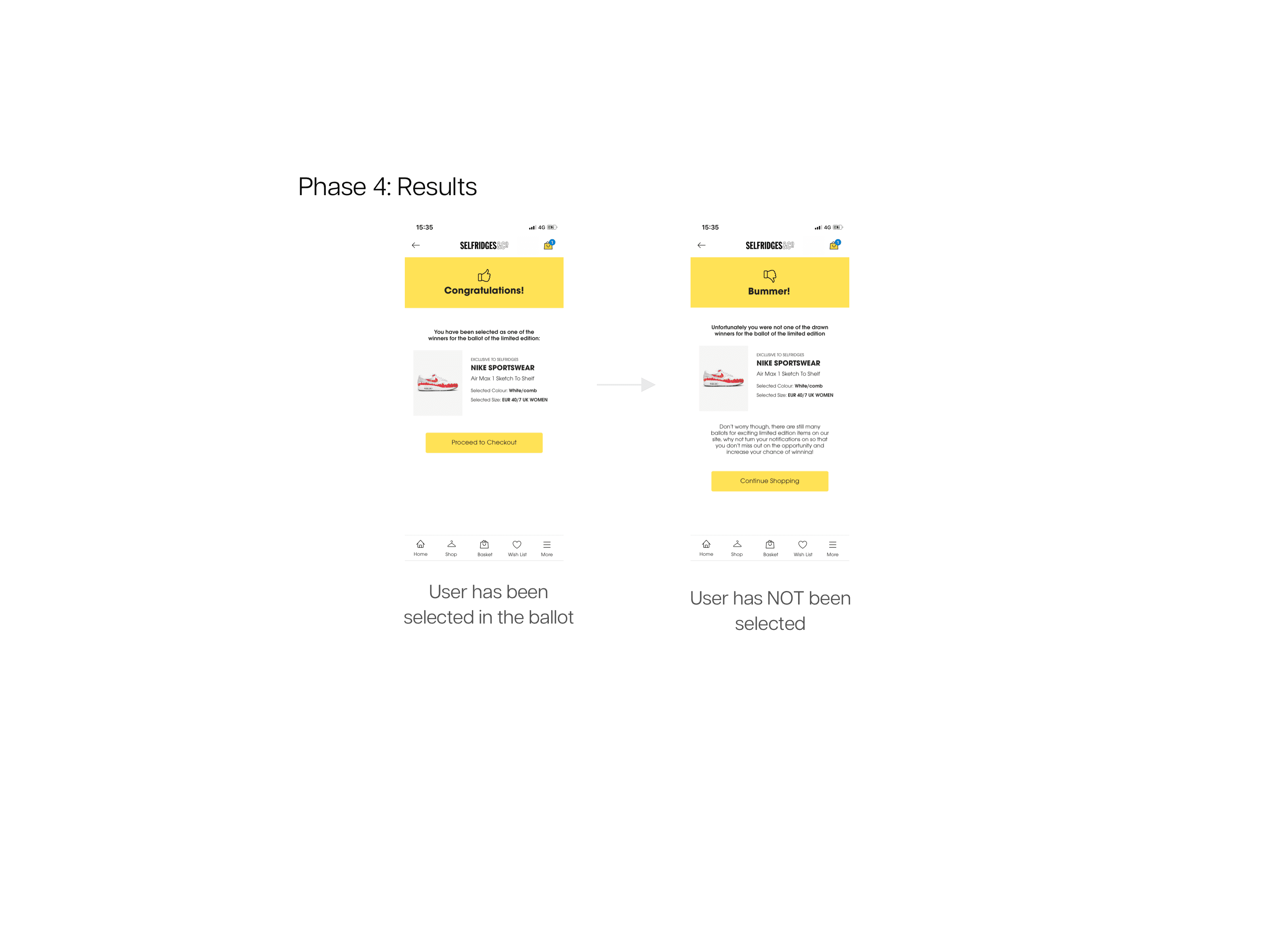
I have worked on the first implementation of the Ballot to Buy, or Yellow Draw as is called in the Mobile App currently. The functionality allows users to enter a draw for limited edition products and if successful, be able to buy the product.
The main goal of the project was to create a fool-proof user flow and wireframes to allow users to use the functionality and cover all edge cases (win, loss, etc.)
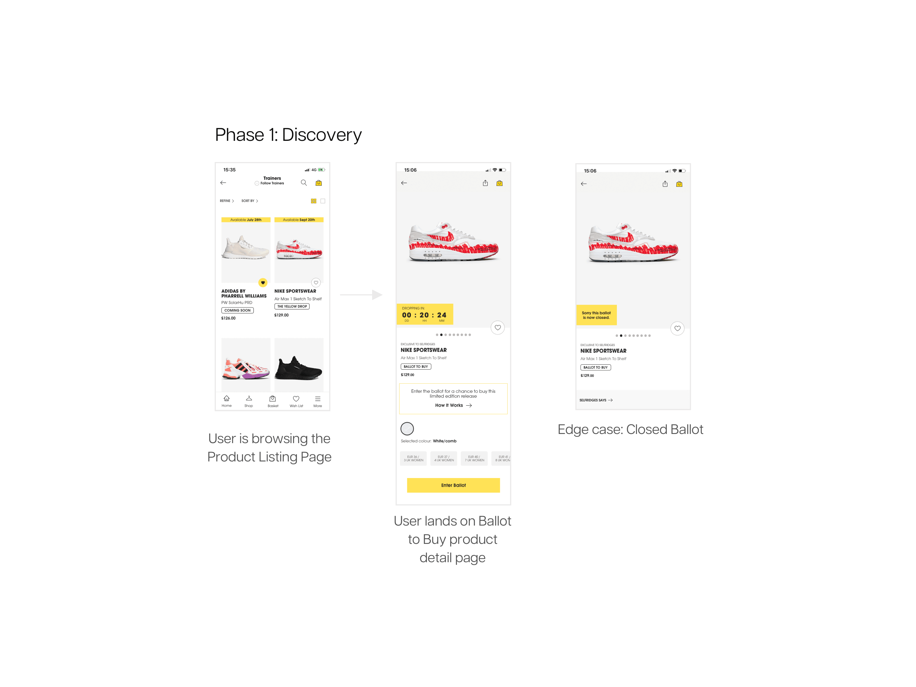
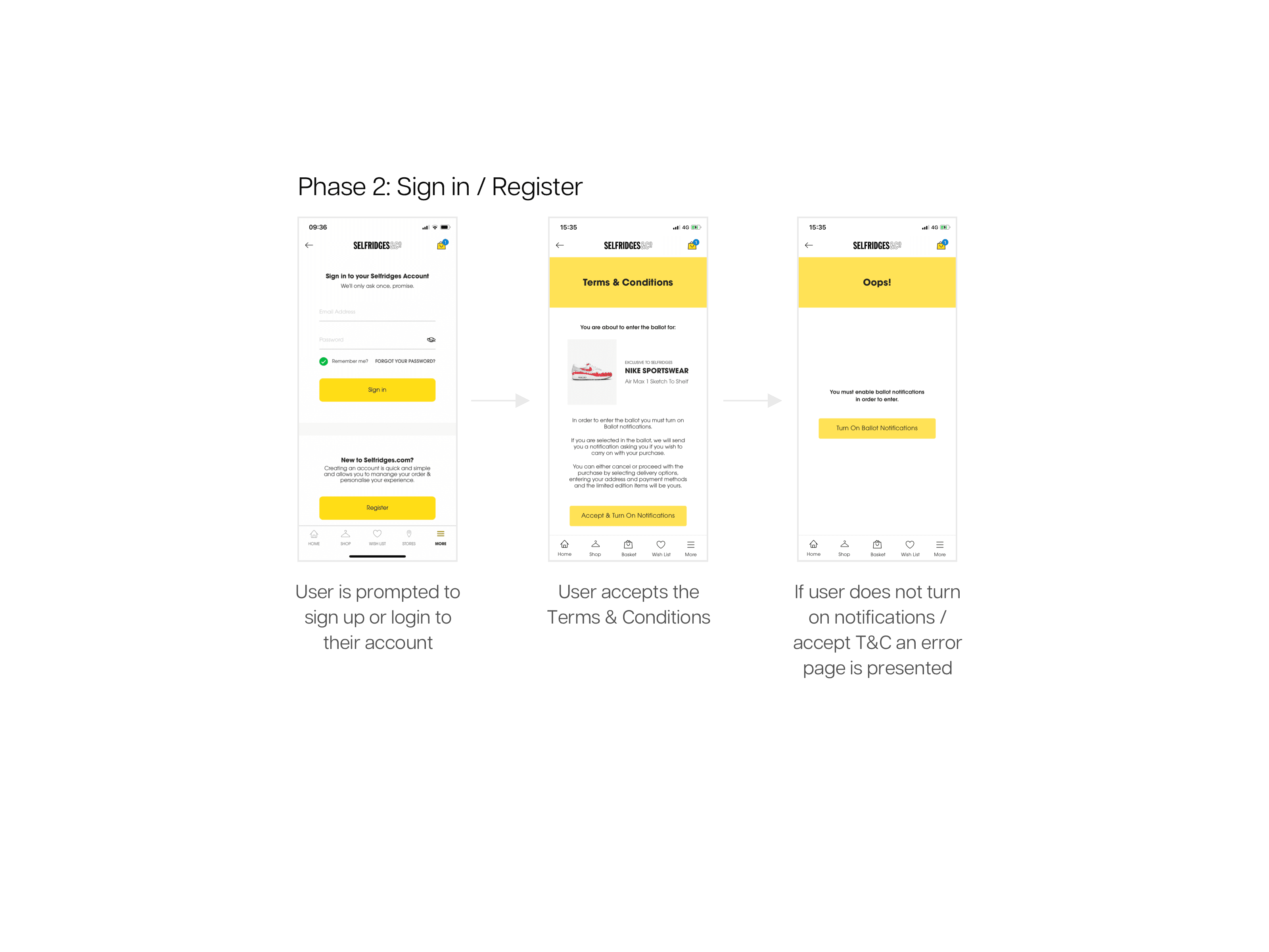
I have created basic wireflows to outline the functionality and the interface:
Phase 1: Discovery
Phase 2: Sign in / Register
Phase 3: Entering the ballot
Phase 4: Results
Further to implementing the first strictly UX iteration of the design of the Ballot, I have also adapted the older design version to the new re-design.
Latest Work
Creating a design system from scratch
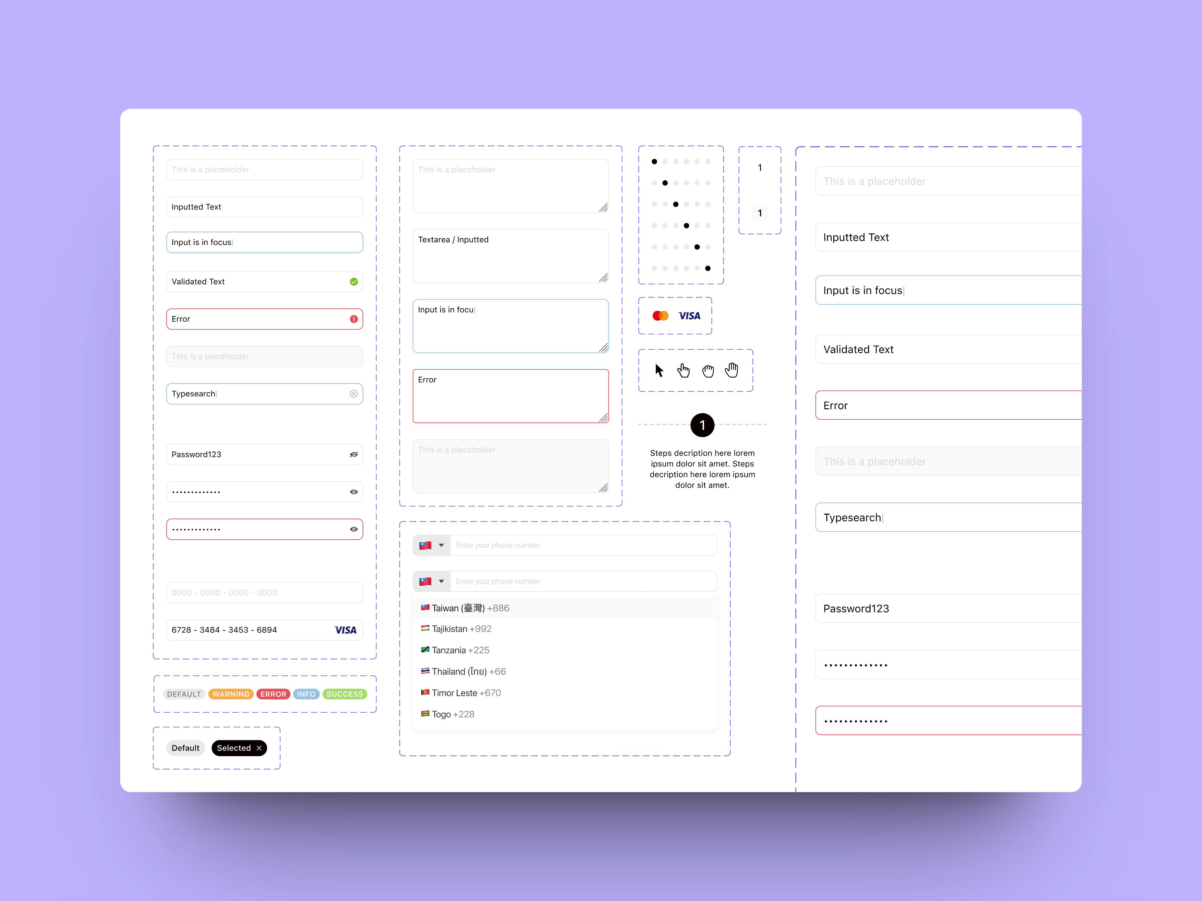
The Components
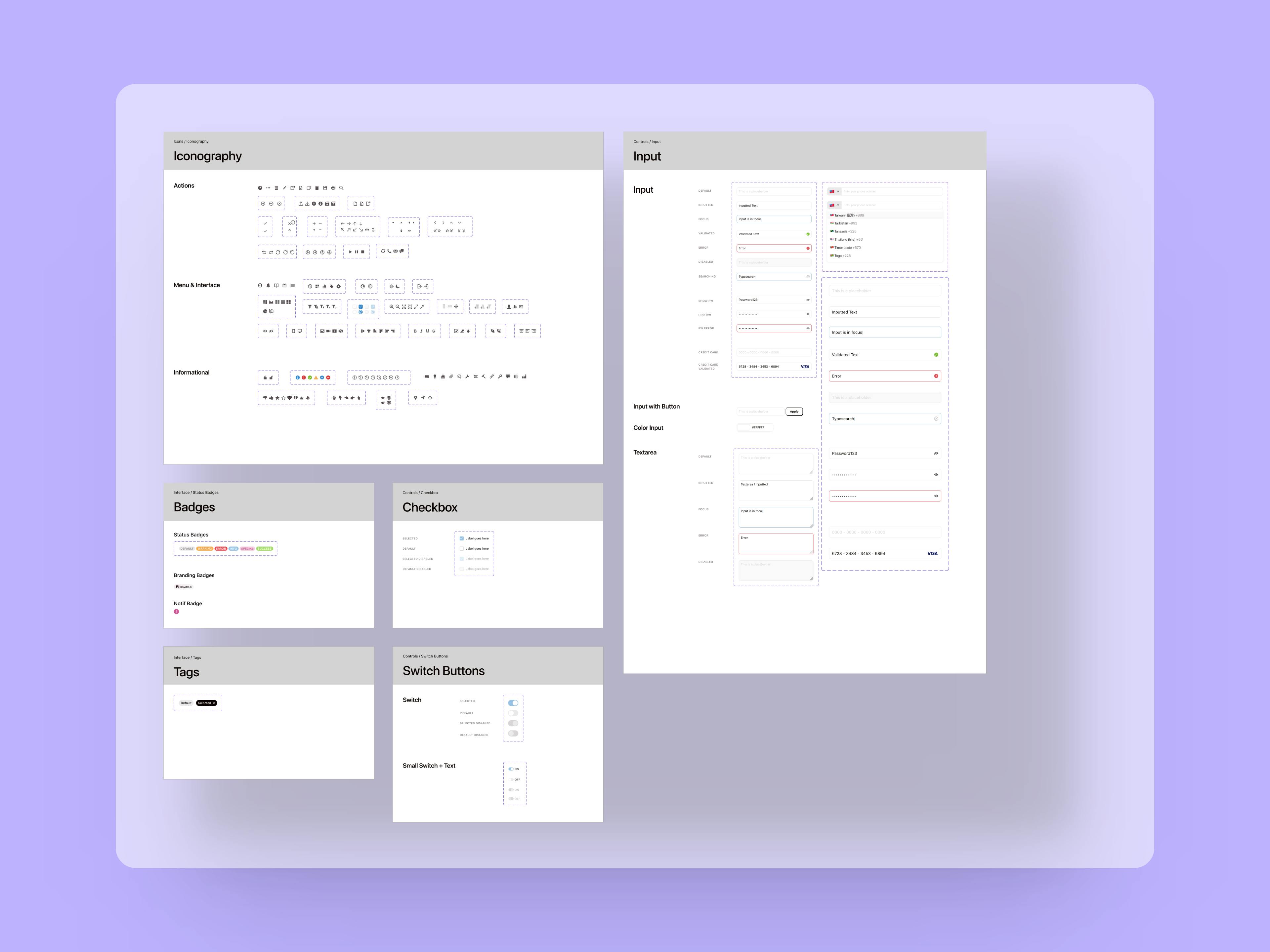
The Atoms
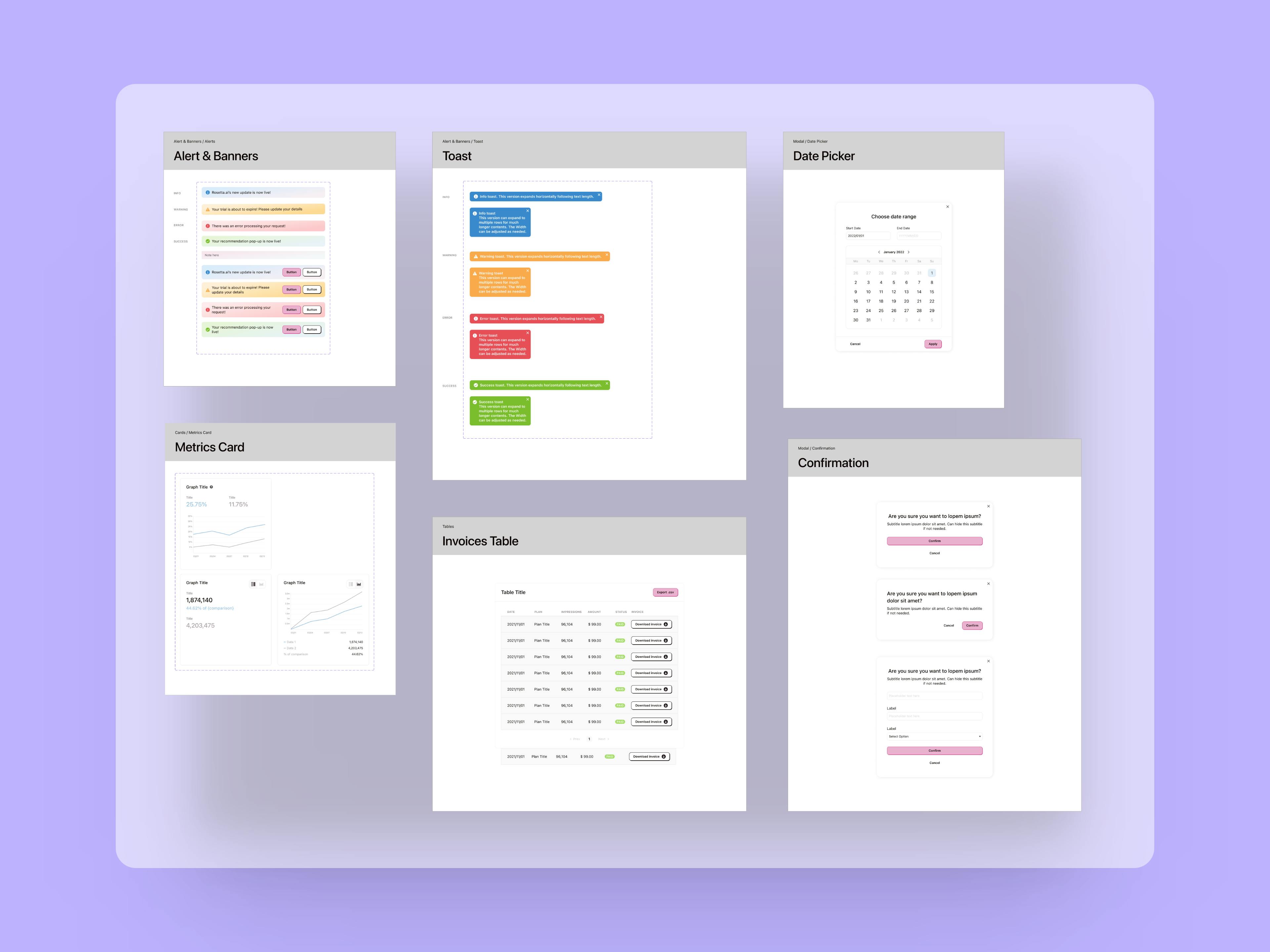
The Organisms


A good component library and design system are fundamental to improve speed of execution and allow teams to iterate through ideas and hypotheses much faster compared to the classic workflow where UX and UI are separate.
Revamping a career website for an outstanding candidate experience and job discovery
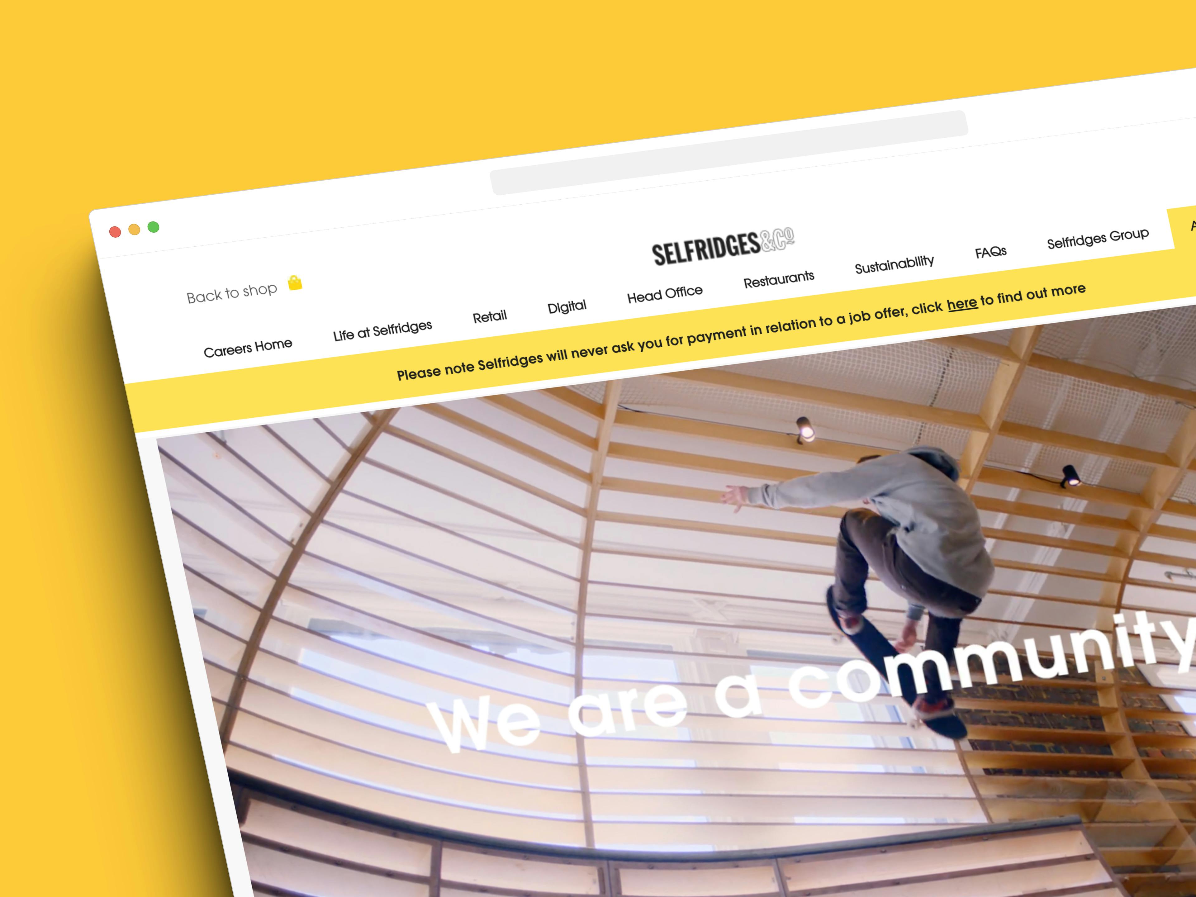
The completed website

Selfridges is a world-renowned, award winning department and online store with 4 stores in the UK and a worldwide online presence.
Designing an engaging and accessible site for a rare dementia support charity
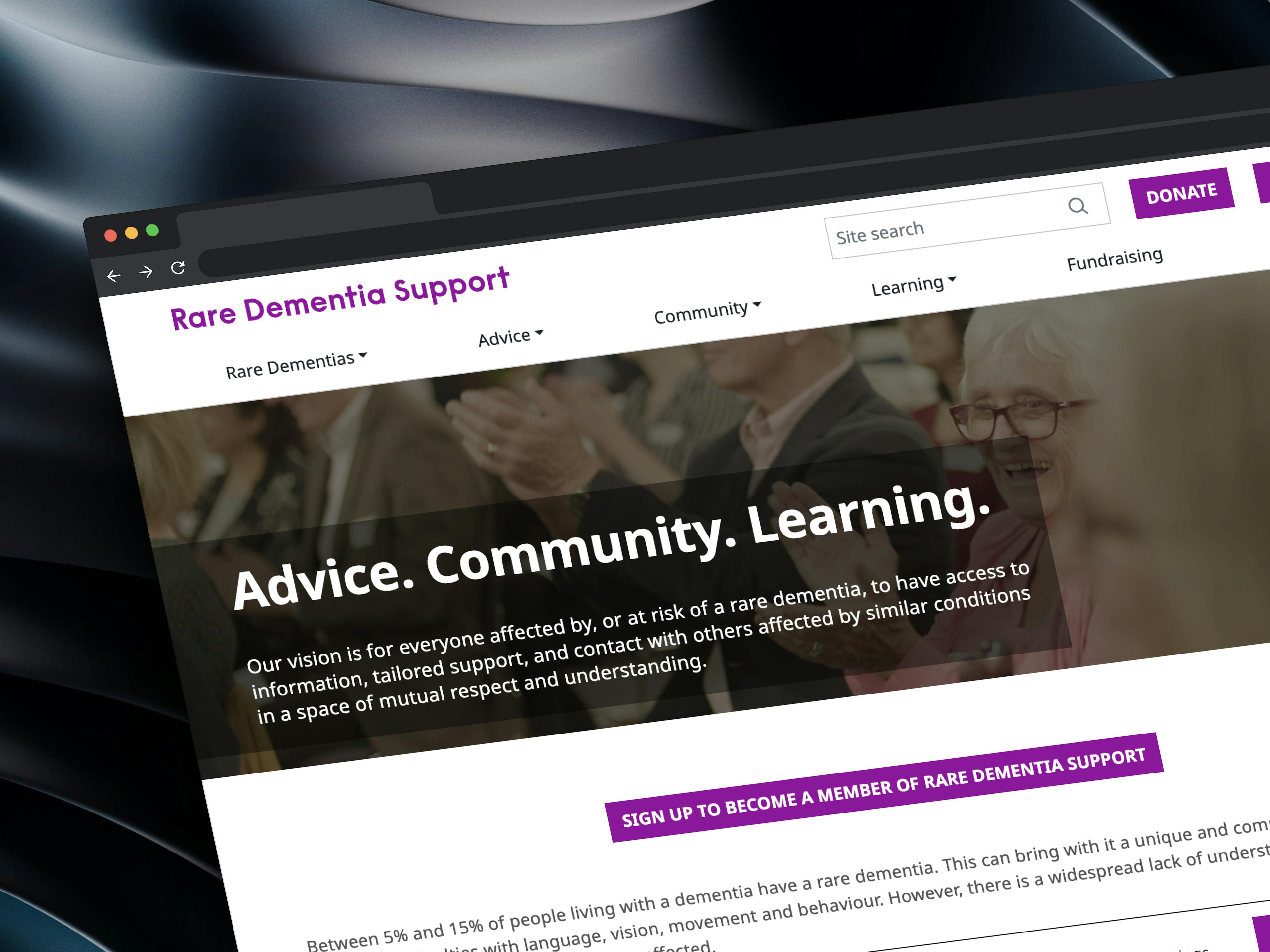
The completed website

Rare Dementia Support (RDS) is a world-leading, UK-based service provided by the UCL Dementia Research Centre (DRC) and partners and funded by The National Brain Appeal.
Crafting innovative solutions for an e-commerce giant

Re-design work for the mobile app
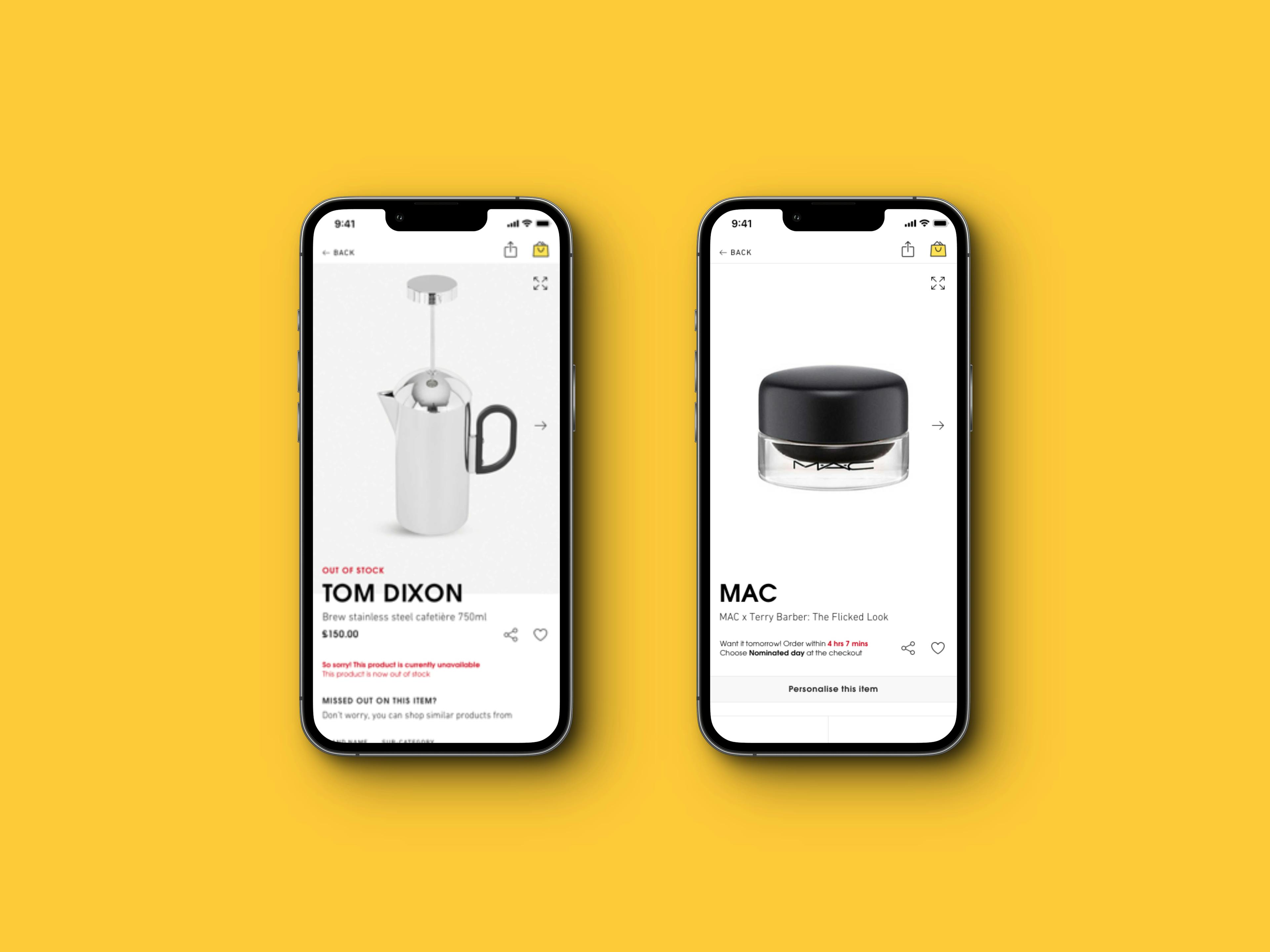
Collection of edge cases for the Product Detail Page

A re-designed and exciting careers site.


I have worked as part of the Selfridges UX team and have taken part in exciting projects such as the re-design of their website and mobile apps, the re-design of their careers site and a number of innovative and experimental solutions for their digital assets that resulted in significant improvements in their metrics.
