Revamping a career website for an outstanding candidate experience and job discovery
Selfridges is a world-renowned, award winning department and online store with 4 stores in the UK and a worldwide online presence.
The Selfridges Human Resources department was in need of a re-design of their careers site with the objectives of attracting major talent through an inspiring and informative site
Scope
- User Research & Discovery
- User Experience Design
- Usability Testing
Brief
- Create an exciting site to push the Selfridges employer brand and ethos and help attract top talent across Retail and Technology sectors
- Re-design the current version of the site with focus on Life at Selfridges, with easy access to the application platform.
- Create pages with existing elements within the AEM Content Management System
The process
Research & Discovery
The main focus of the discovery phase was to create an inspirational flow and content for highly skilled users to join the company and create a site that can compete, at a talent acquisition level, with up and coming industry giants such as Farfetch, Canada Goose, and also established businesses such as Harvey Nichols.
After a short research conducted together with the HR team and prospective and existing employees the following pains and objectives came to light:

Following the initial user interviews and a quick competitive analysis we moved on to the ideation stage:
The Journey
The site’s customer journey has been segmented in 3 separate sections:

The focus of the re-design iteration was all around the part 1 of the journey; the discovery. The technical flow of the candidate application was handled by a third party software and couldn’t be modified.
The focus, then, was to help users complete objectives 3 and 4 and solve pain points 1 and 2.
Proposed Solutions
I proposed several solutions to directly target the key objectives laid out earlier:

Personas
In order to be able to create detailed user flows I dug deeper into the potential candidates profiles and created 3 distinct personas, differentiated by their intention when reaching the site

User Flows
I have then created user flows for each part of the journey, below is the homepage flow

Information Architecture
And created the information architecture of the new site

Wireframes
I have drafted wireframes based on the flows and information architecture ideated earlier.
As this project was using already existent AEM components, creating high fidelity mockups was out of scope.

Prototype & Usability Testing
The wireframes have then been packaged in a prototype with mid-fidelity mockups in InVision Studio and tested with selected Selfridges employees.
The test turned out positive with minor changes that resulted in a more simplified navigation and structure, especially around the content and department pages.
The result:
Selfridges Careers now has a sleek and modern site, with outstanding multimedia content created by their creative team. The site is inspiring, easy to navigate, informative and with easy access to job descriptions, a big step up from the previous site
The website has recently been nominated for a careers site award.


Latest Work
Creating a design system from scratch
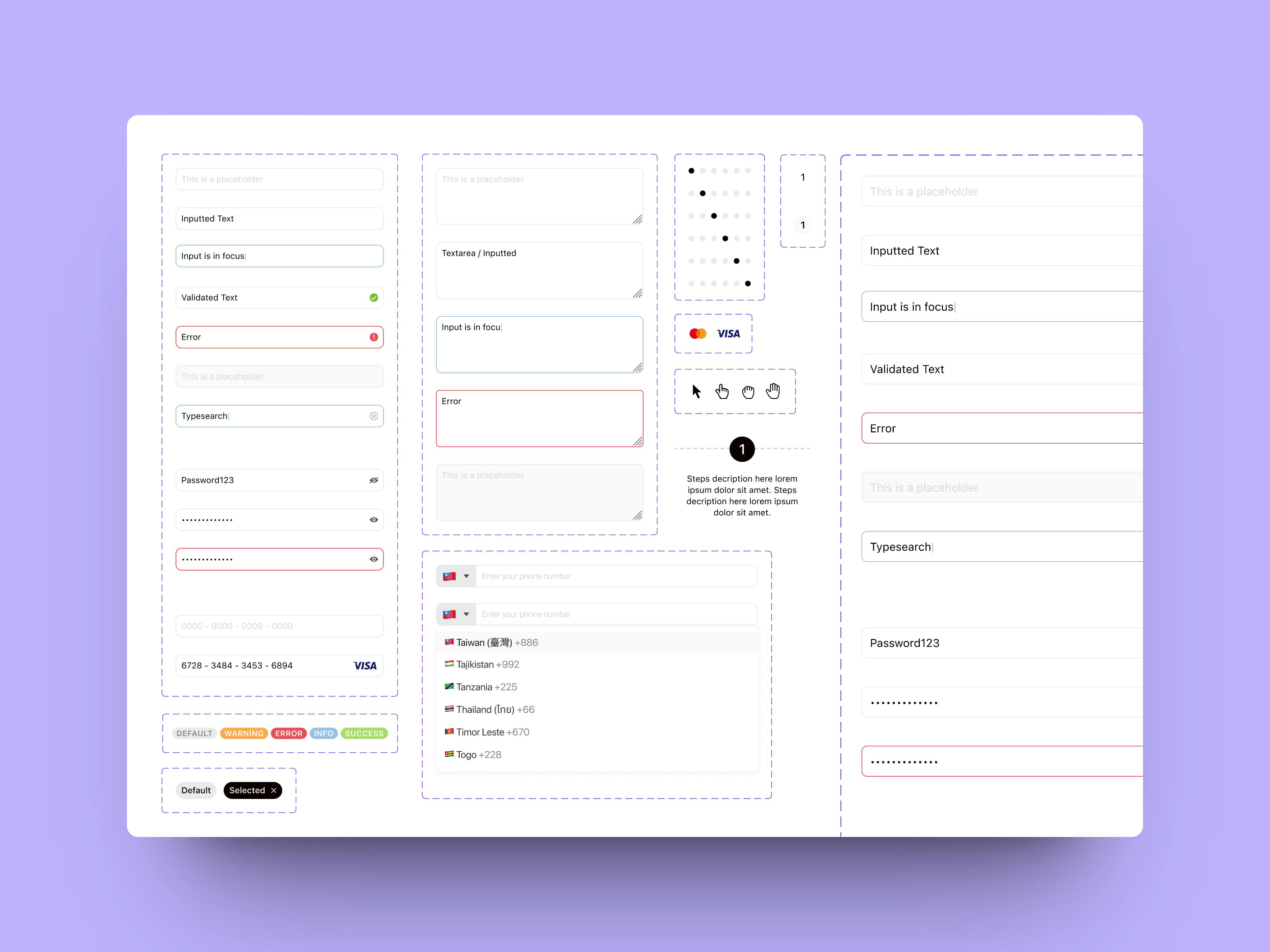
The Components
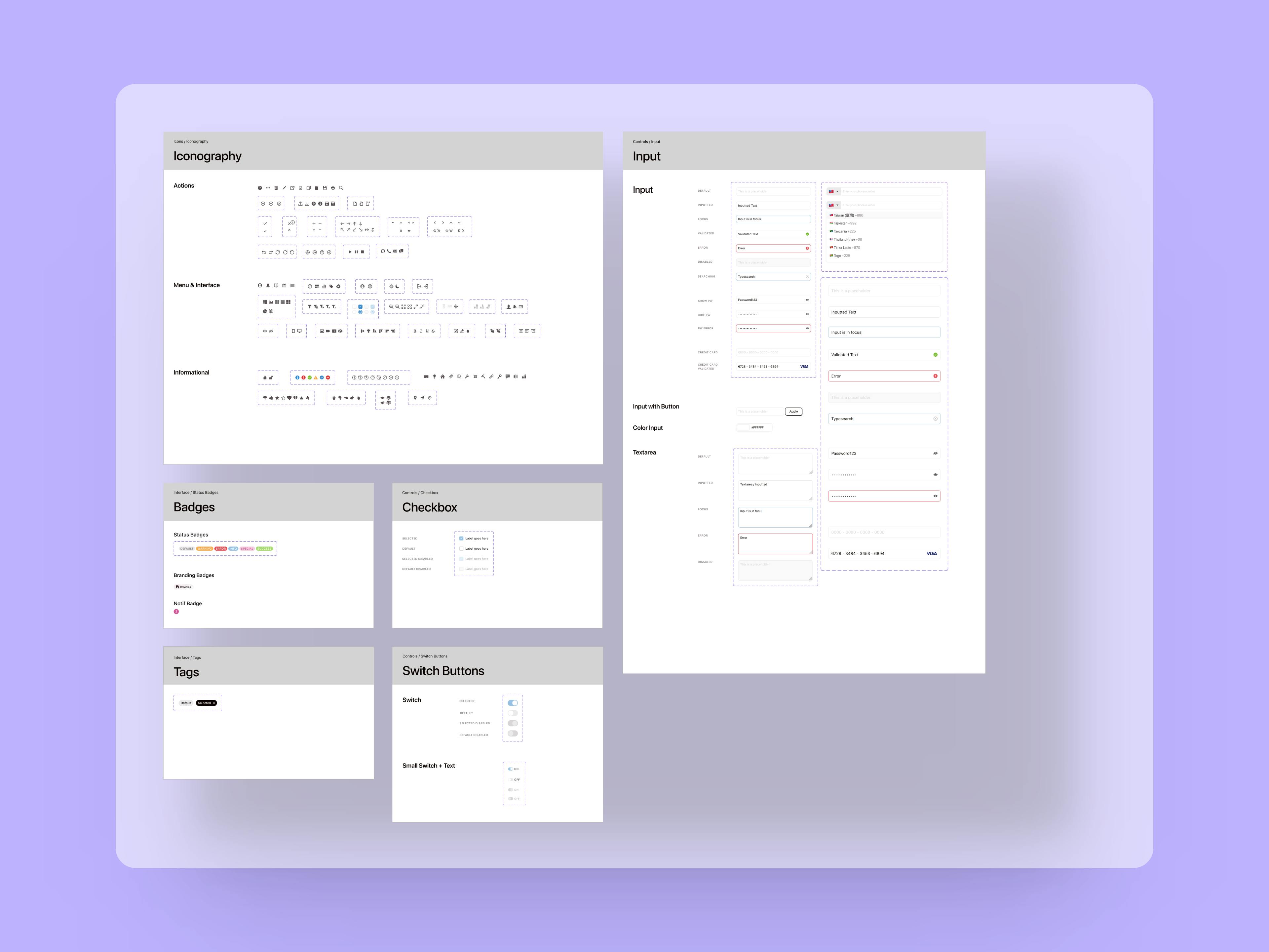
The Atoms
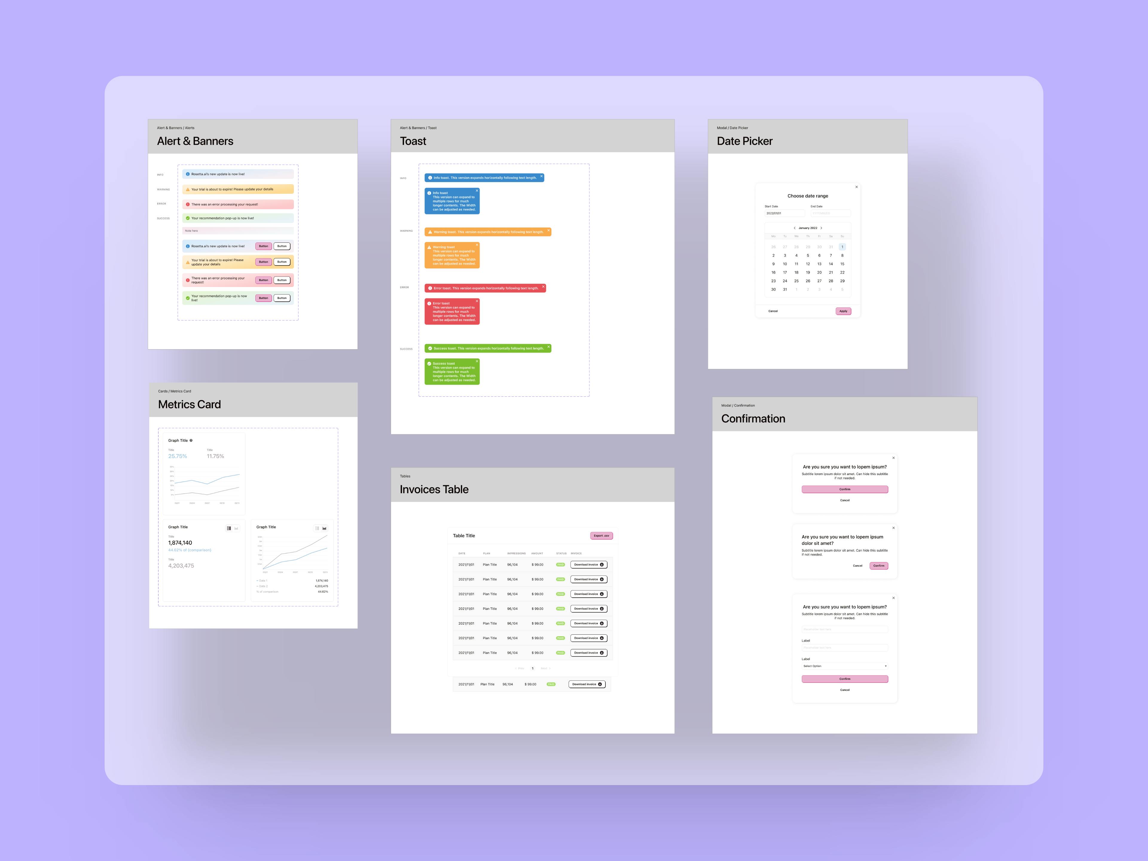
The Organisms


A good component library and design system are fundamental to improve speed of execution and allow teams to iterate through ideas and hypotheses much faster compared to the classic workflow where UX and UI are separate.
Revamping a career website for an outstanding candidate experience and job discovery
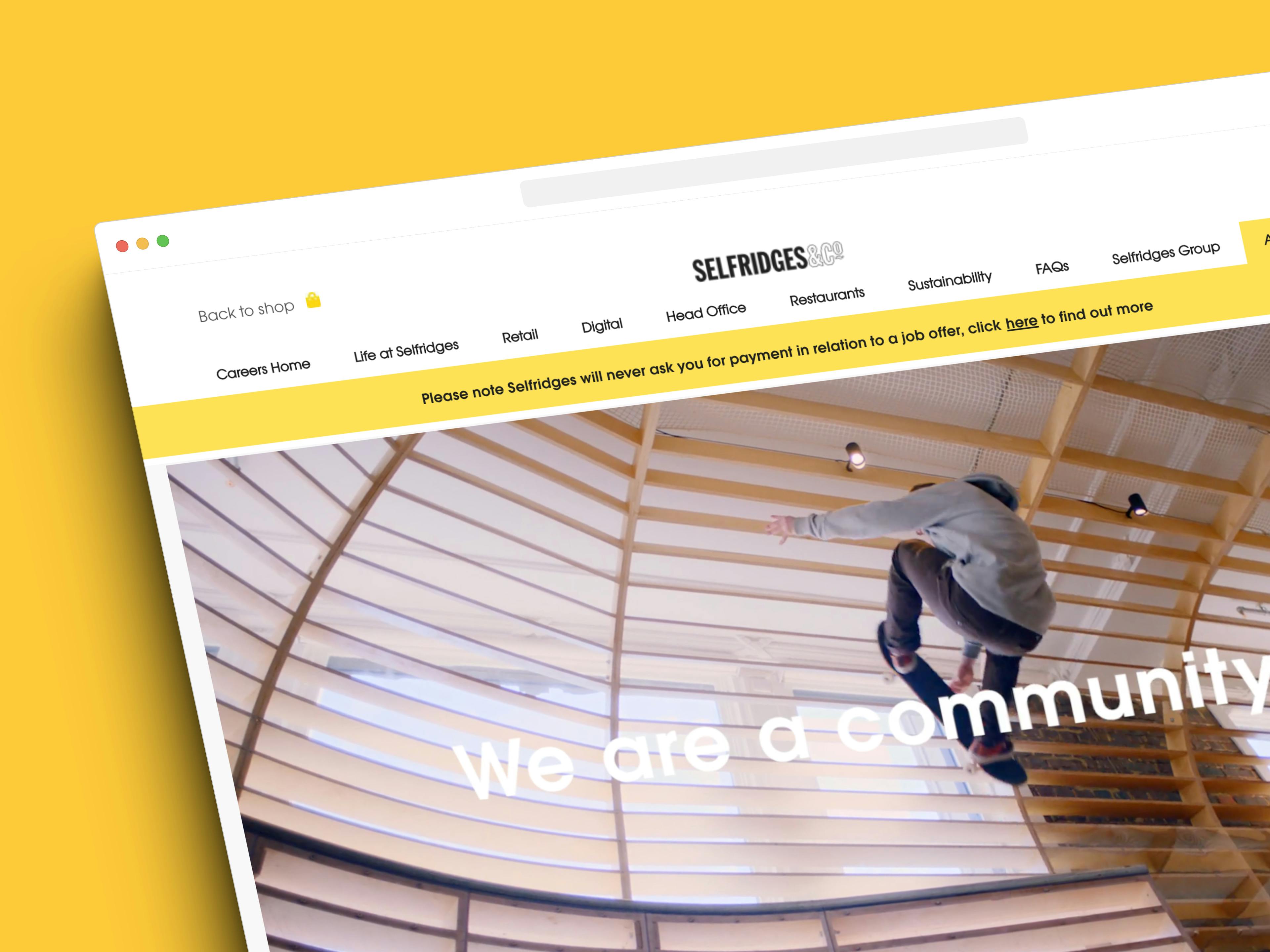
The completed website

Selfridges is a world-renowned, award winning department and online store with 4 stores in the UK and a worldwide online presence.
Designing an engaging and accessible site for a rare dementia support charity
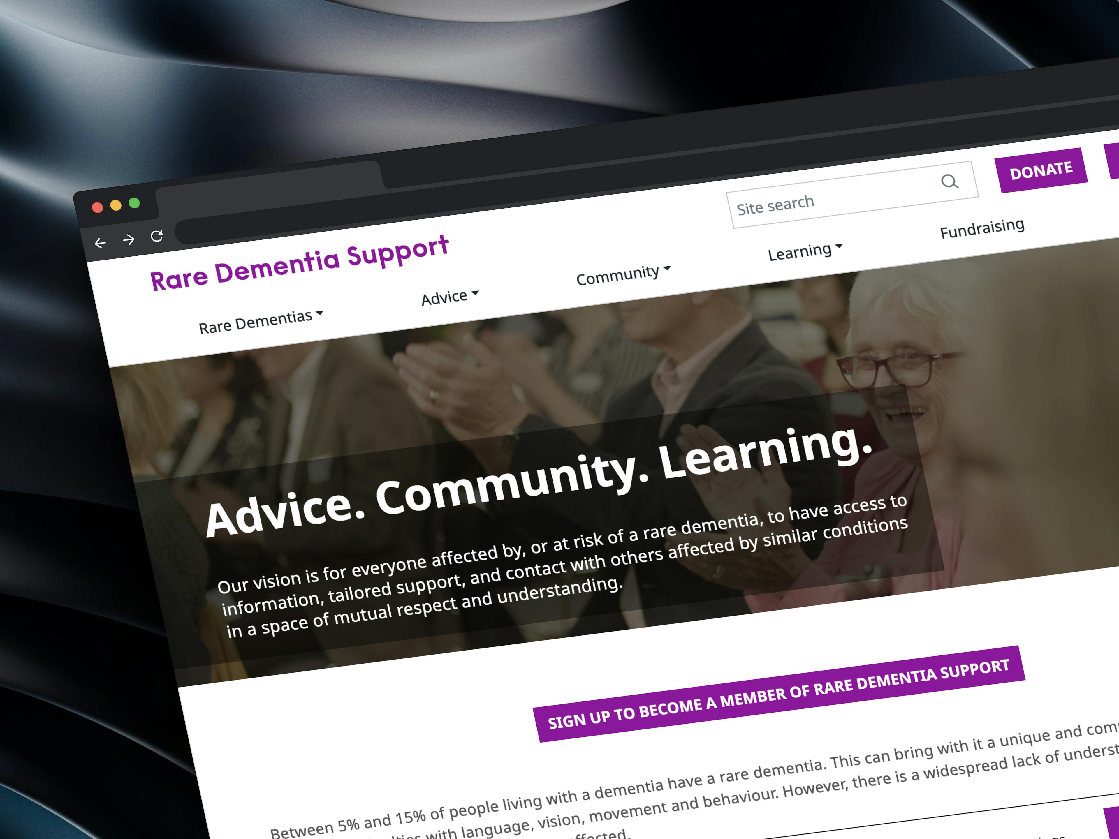
The completed website

Rare Dementia Support (RDS) is a world-leading, UK-based service provided by the UCL Dementia Research Centre (DRC) and partners and funded by The National Brain Appeal.
Crafting innovative solutions for an e-commerce giant
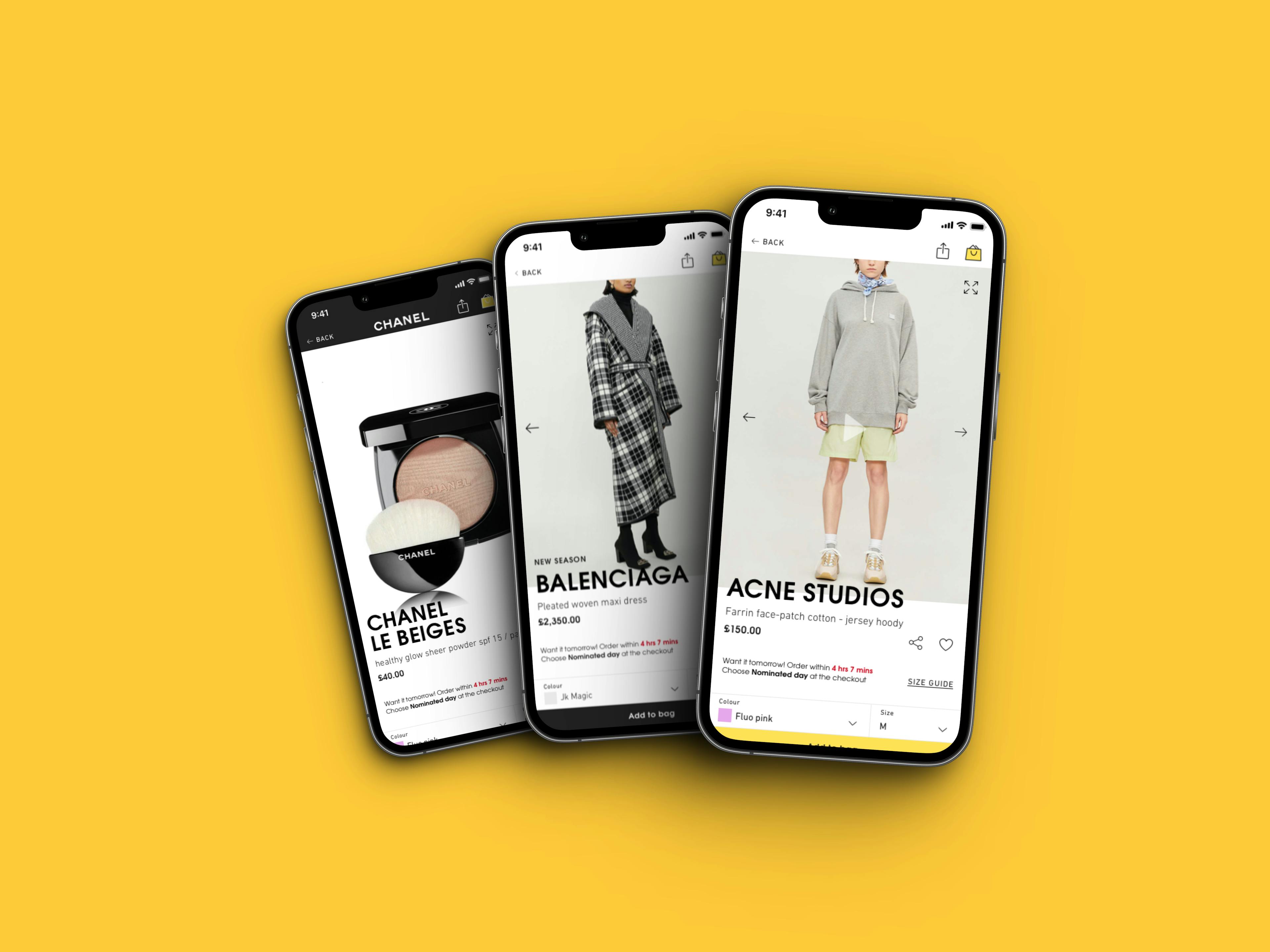
Re-design work for the mobile app
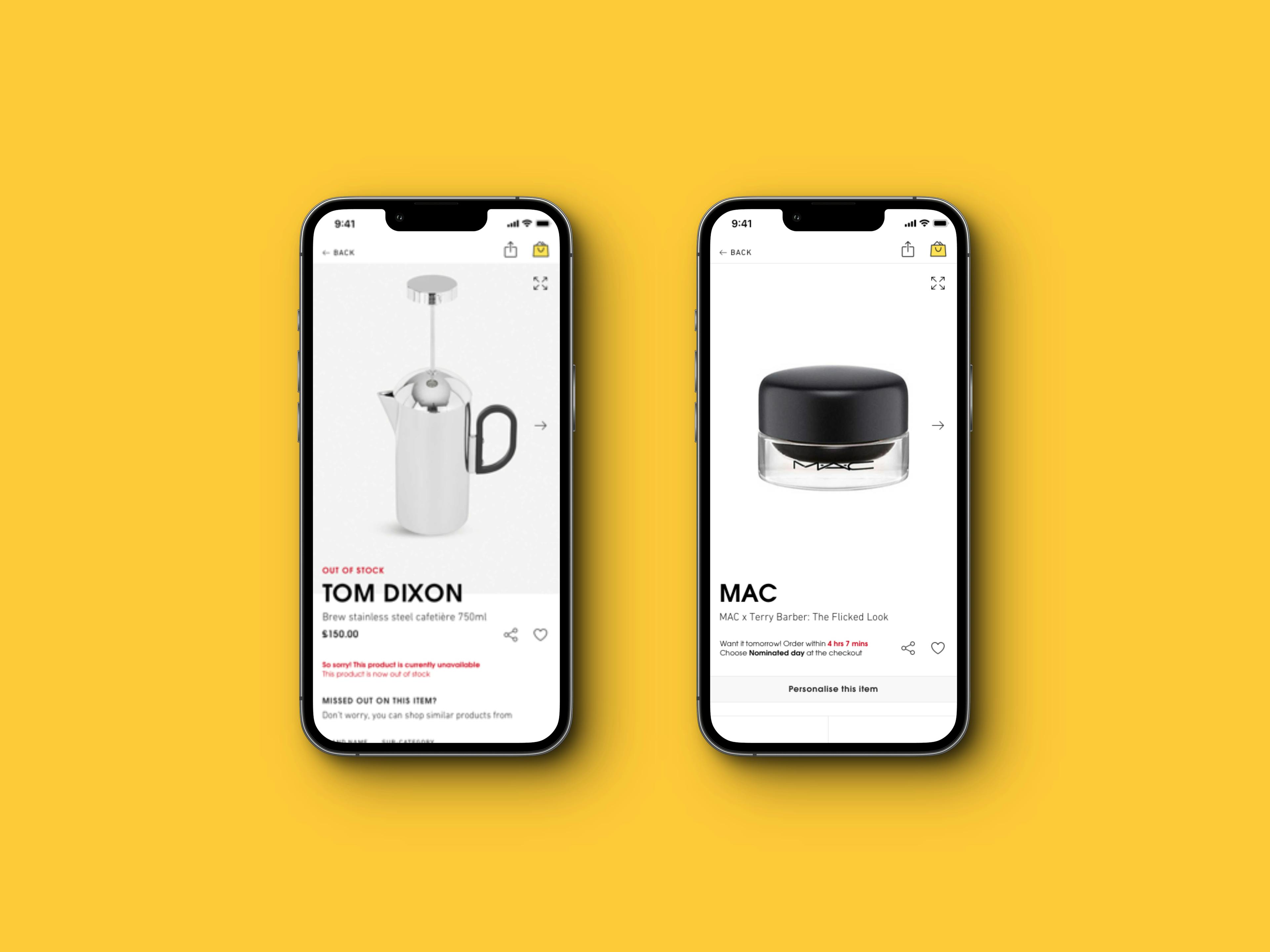
Collection of edge cases for the Product Detail Page

A re-designed and exciting careers site.


I have worked as part of the Selfridges UX team and have taken part in exciting projects such as the re-design of their website and mobile apps, the re-design of their careers site and a number of innovative and experimental solutions for their digital assets that resulted in significant improvements in their metrics.
