Designing a no-code website for a boutique yoga studio
Ocean Yoga Kenting is a boutique yoga studio in southern Taiwan. I implemented their brand identity to a recognisable and minimal brand reminiscent of the tropical vibes of the place and designed and built their website within the Wix Editor allowing the studio to manage their business, their marketing and their customers seamlessly thanks to the extensive Wix features and allow them to make changes on the go within the no-code editor.
A step by step walkthrough of design and strategy geared towards small business owners
The requirement:Create a website with booking functionality on a limited budget
The final product: A no code website created within Wix with booking and payment functionality
The result: A super easy to use website that allows all clients to book and pay, helping the business increase their sales
First step: Strategy
I sat down with the business owner and outlined the studio`s business requirements. The studio is newly opened with zero customer exposure so the timeline for creating the website was very tight.
The first item of business was to choose a platform that will allow a non technical business owner to get up to speed with the necessary tools to run a business online and a booking platform that was easy to set up and had traditional mandarin language capabilities
After researching a few software options such as momoyoga or calendly, the business owner decided to move on with Wix, which has a pretty decent booking platform as well as traditional mandarin language capability.
Second step: Branding
The requirement for the brand was to be simple, memorable but sophisticated at the same time. I have created a boho-style logo showcasing the tropical feel of the studio and the area the studio is located in:


The brand colours are inspired by the nature around Kenting, with sand yellow backgrounds and dark green accents, to give a feel of nature

The design:
Considering the tight timeline the website has been designed and built at the same time with the classic Wix editor, choosing not to make the most of Wix EditorX advanced functionality for the time being.

Site structure

The result is a clean site that clearly showcases the look and feel of the studio, its brand values and easily allows potential customers to gather information about the studio's facilities and services and book their classes on the website.
Latest Work
Creating a design system from scratch
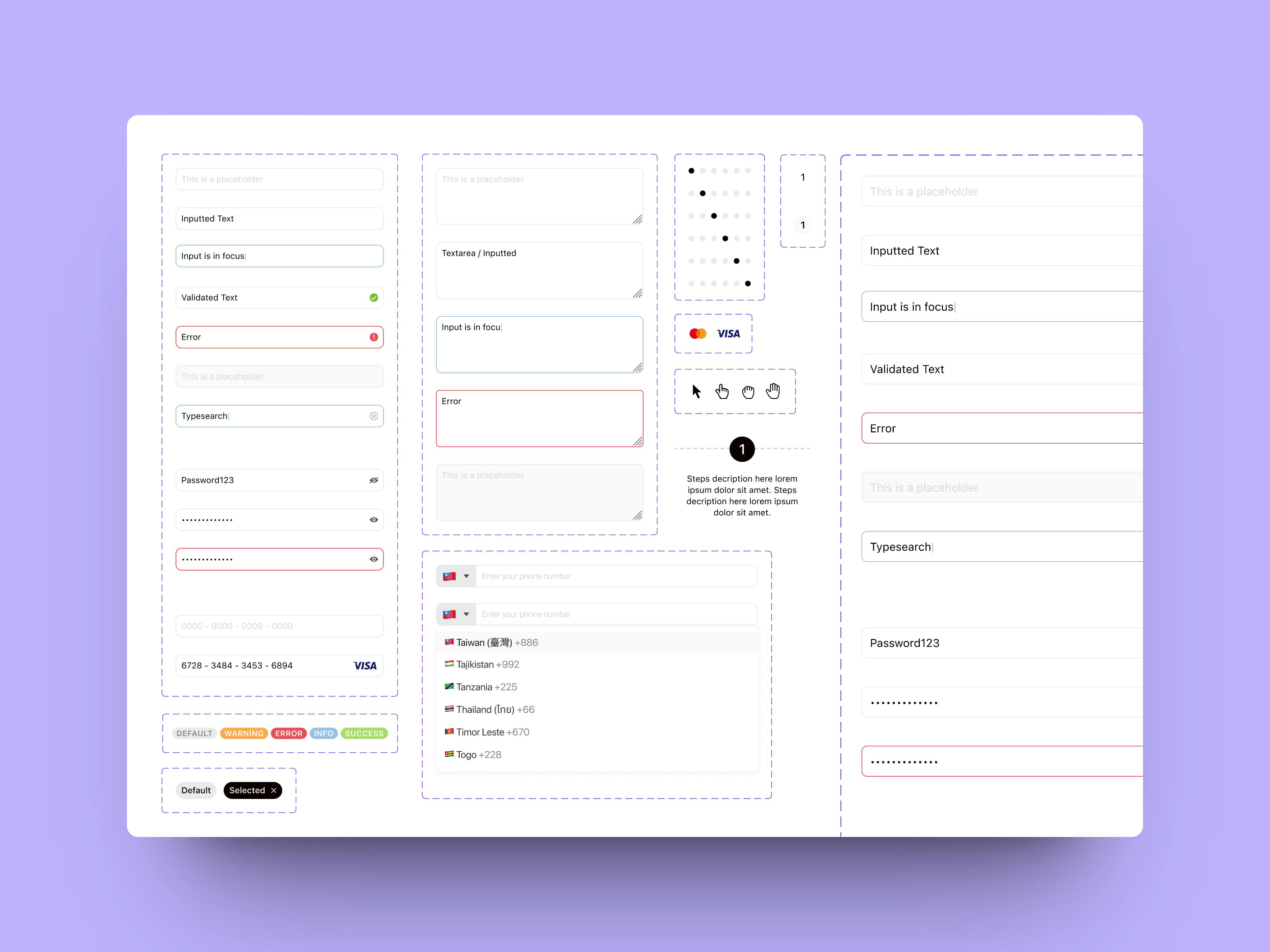
The Components
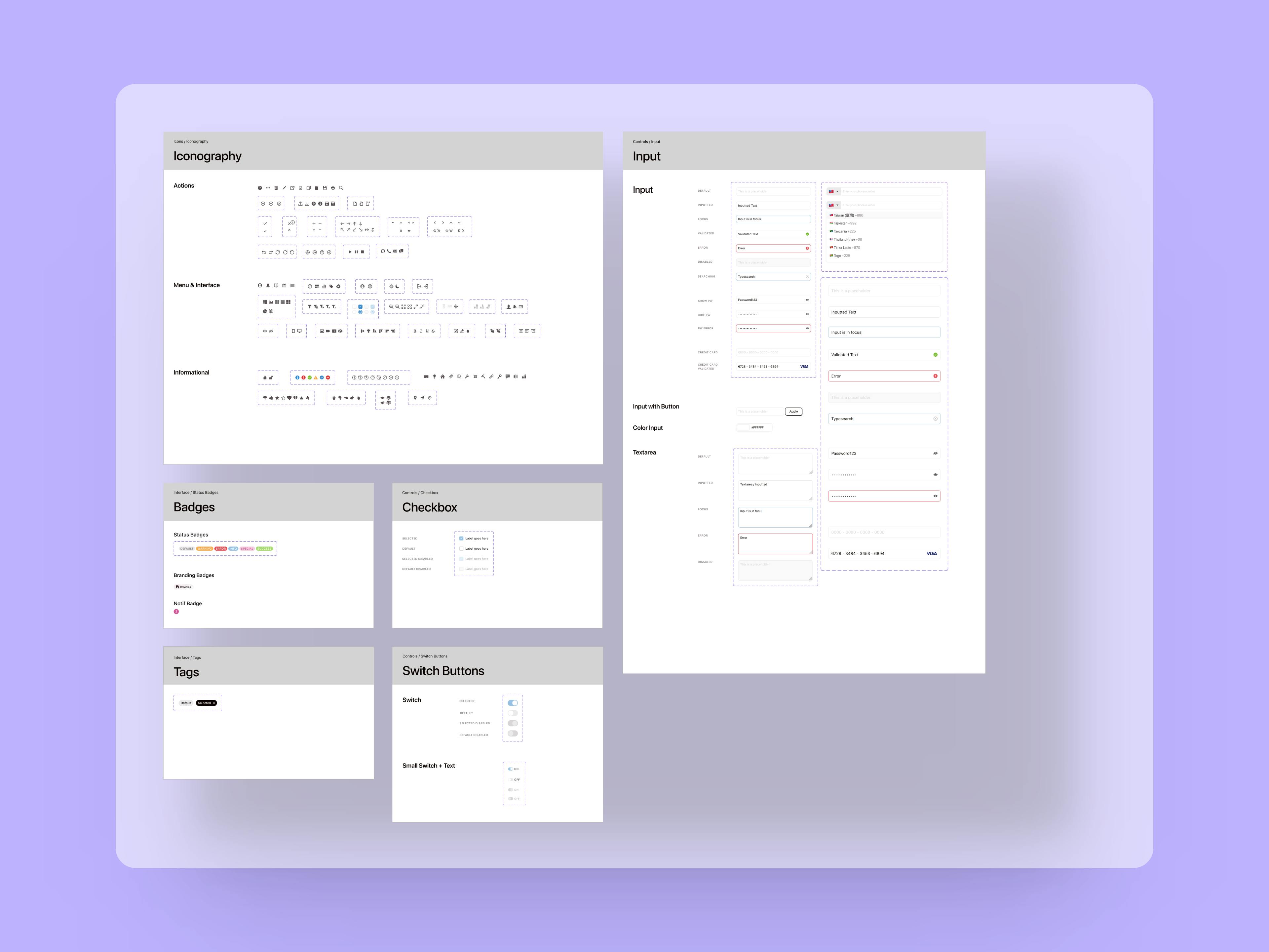
The Atoms
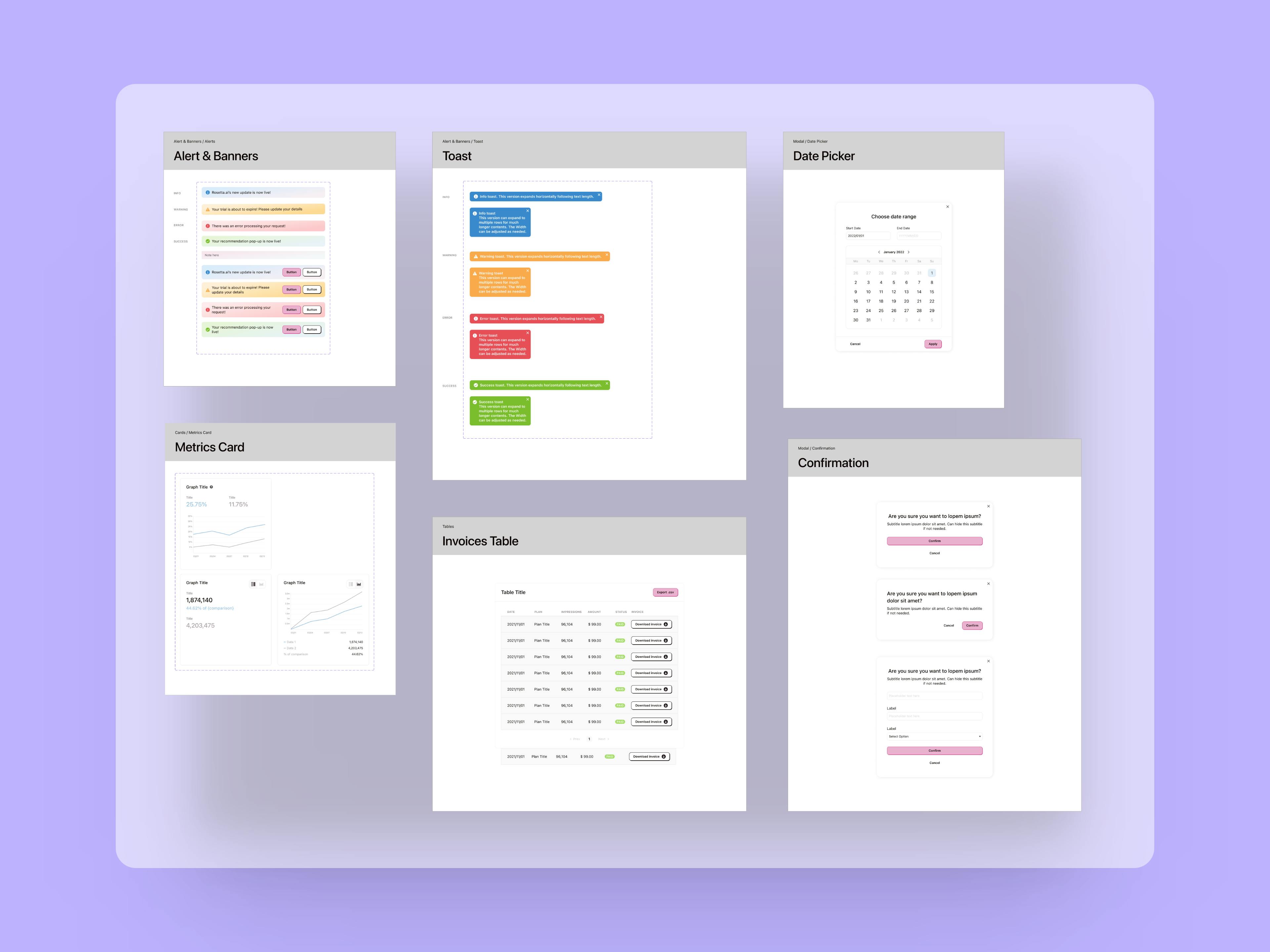
The Organisms


A good component library and design system are fundamental to improve speed of execution and allow teams to iterate through ideas and hypotheses much faster compared to the classic workflow where UX and UI are separate.
Revamping a career website for an outstanding candidate experience and job discovery
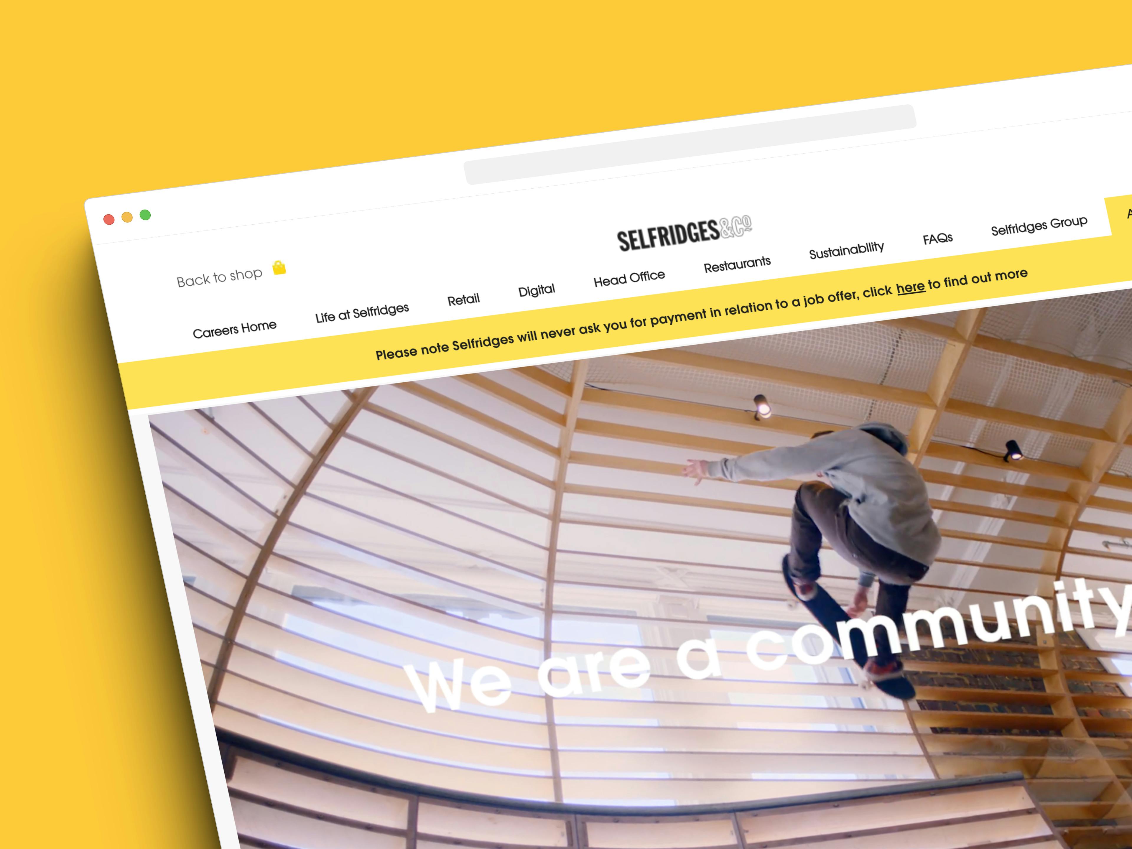
The completed website

Selfridges is a world-renowned, award winning department and online store with 4 stores in the UK and a worldwide online presence.
Designing an engaging and accessible site for a rare dementia support charity
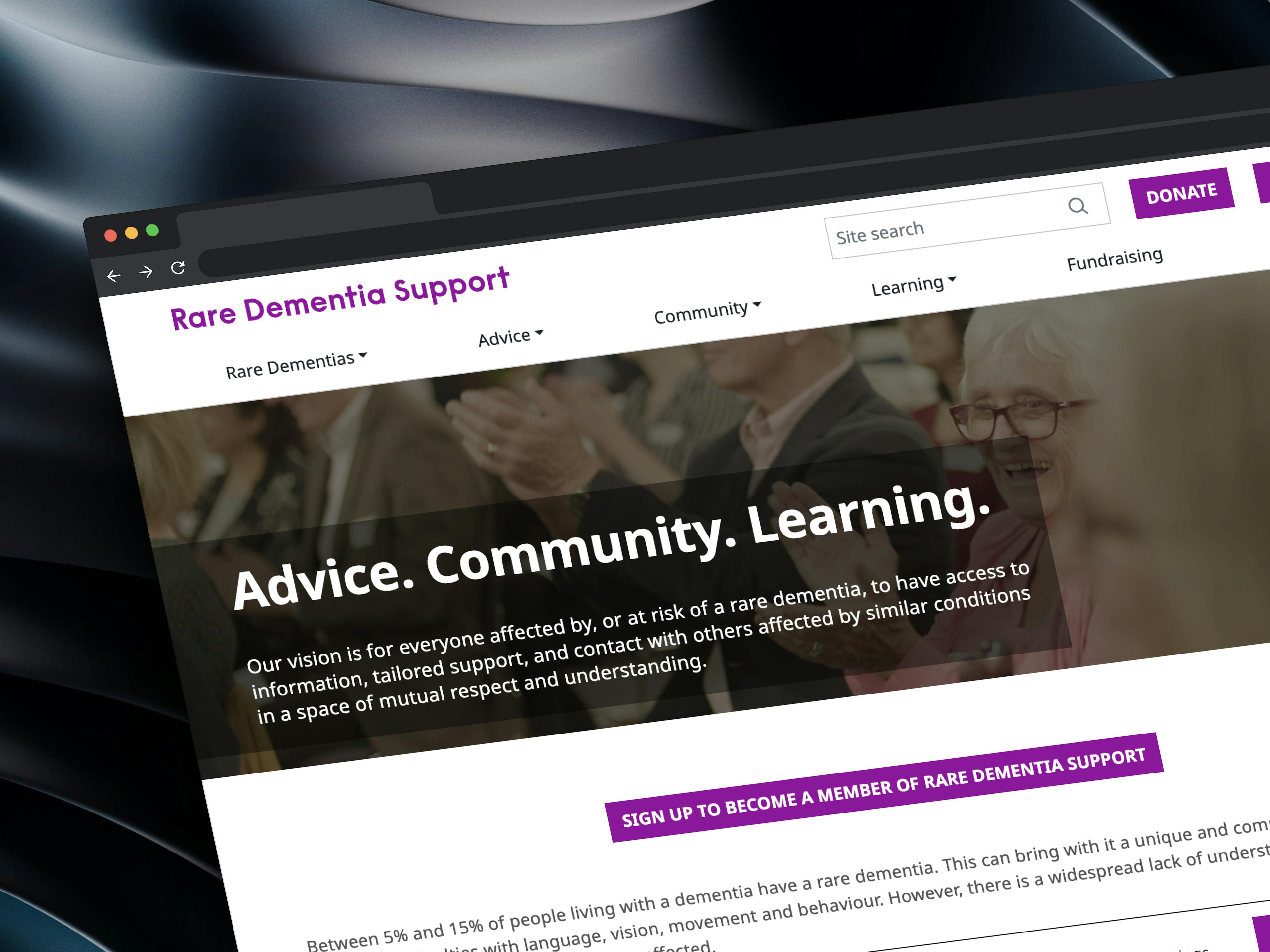
The completed website

Rare Dementia Support (RDS) is a world-leading, UK-based service provided by the UCL Dementia Research Centre (DRC) and partners and funded by The National Brain Appeal.
Crafting innovative solutions for an e-commerce giant
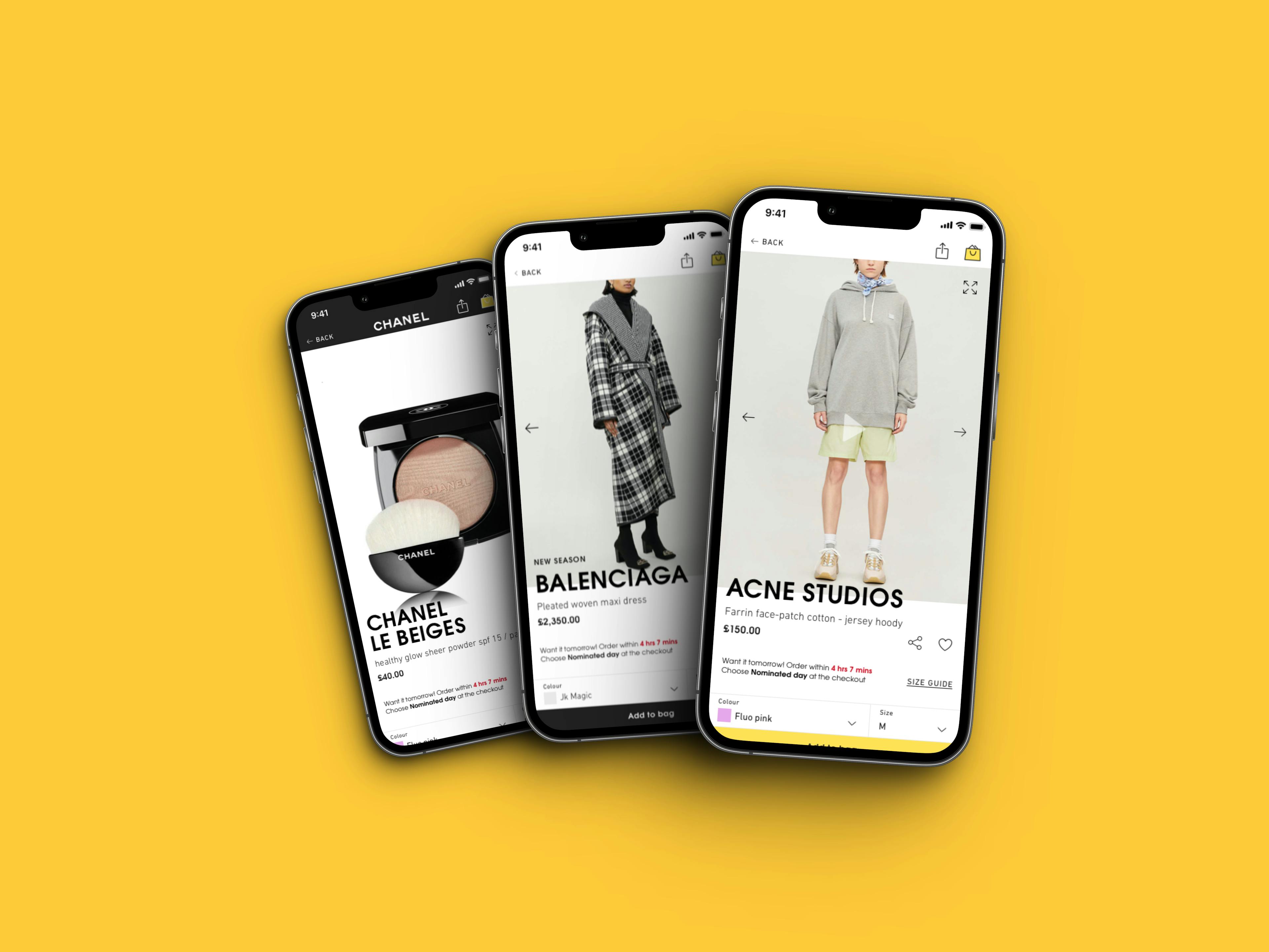
Re-design work for the mobile app
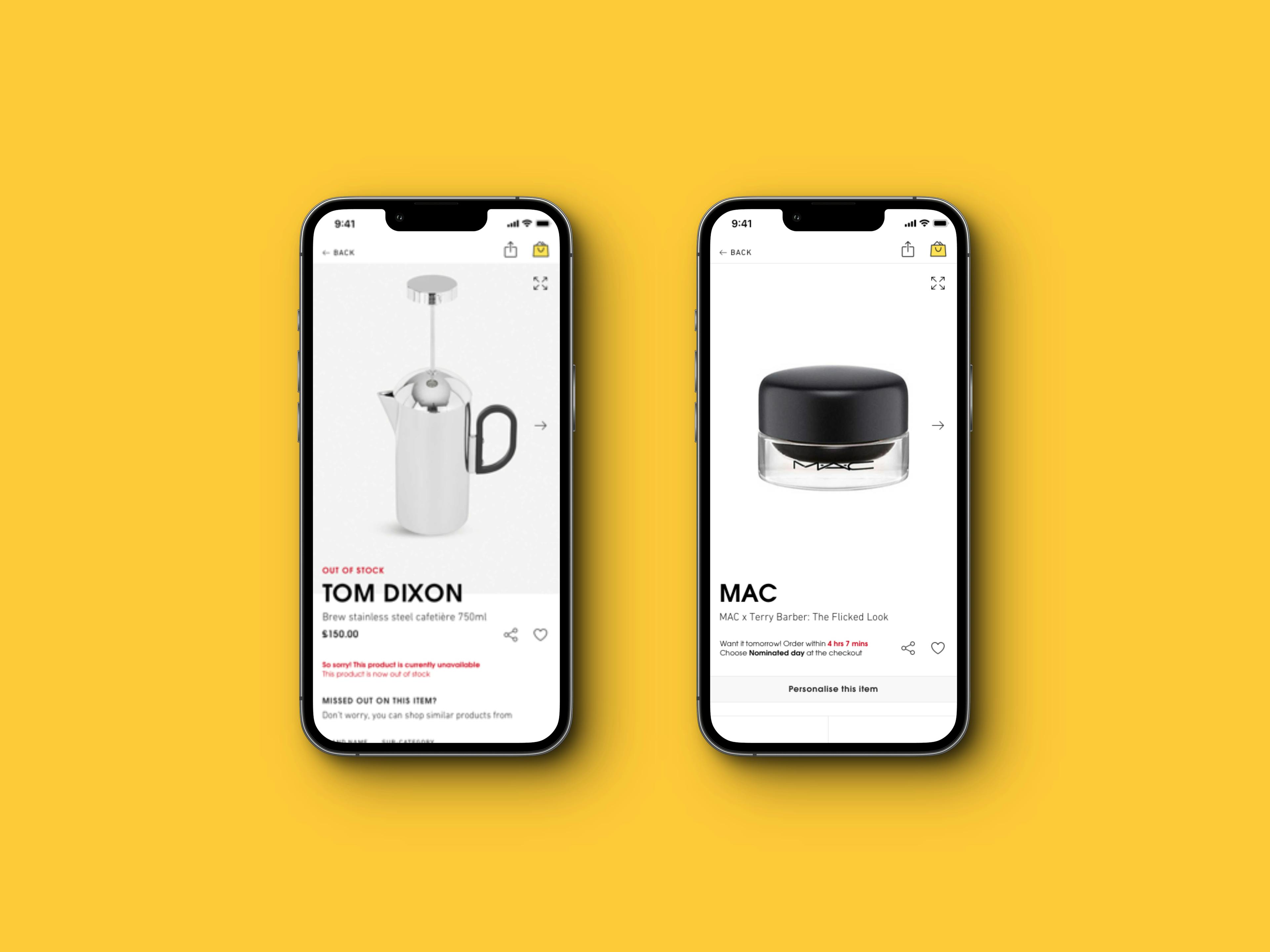
Collection of edge cases for the Product Detail Page

A re-designed and exciting careers site.


I have worked as part of the Selfridges UX team and have taken part in exciting projects such as the re-design of their website and mobile apps, the re-design of their careers site and a number of innovative and experimental solutions for their digital assets that resulted in significant improvements in their metrics.
